


In the realm of website creation, Gutenberg stands as a beacon of innovation, reshaping the landscape of mobile web design. As an integral component of WordPress development services, Gutenberg’s editor heralds a new era of creativity and efficiency. With its intuitive block-based system, crafting captivating and responsive web pages for mobile devices becomes seamless. Whether you are a seasoned developer or a newcomer, Gutenberg’s user-friendly interface empowers you to sculpt visually stunning websites that effortlessly adapt to various screen sizes.
Join us on a journey to unlock the transformative capabilities of Gutenberg’s editor and unleash the potential of mobile web design. Through exploration and discovery, we delve into the depths of Gutenberg’s power, charting a course toward creating mobile-friendly websites that captivate audiences and elevate user experiences. Embark with us as we navigate the realm of Gutenberg and embark on a journey toward unparalleled digital innovation in mobile web design.
What is Gutenberg?
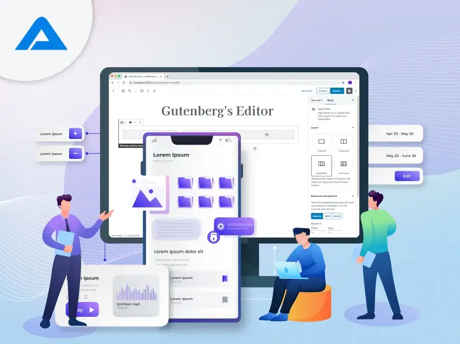
Gutenberg is an innovative WordPress editor that completely transforms how you create and manage content on your website. Unlike traditional editors, Gutenberg utilizes a block-based approach, where each piece of content is represented as a distinct block. These blocks can be easily manipulated, rearranged, and customized, giving you greater flexibility and control over your website’s layout and design.
With Gutenberg, you no longer need complex coding or third-party WordPress plugins to create dynamic and visually appealing content. Instead, you can drag and drop blocks to add text, images, videos, and more, making the content creation process more intuitive and efficient. Whether you’re a seasoned web developer or a novice website owner, Gutenberg offers a user-friendly interface that streamlines the process of building and editing web pages. Plus, it’s fully integrated with WordPress, so you can seamlessly incorporate Gutenberg into your existing website without hassle.
Gutenberg is a game-changer for WordPress users, empowering them to create professional-looking websites easily and creatively.
Main Features of The Gutenberg Editor
Discovering the Top Features of the Gutenberg Editor:
Block-Based Editing:
Block-based Editing is a standout feature of the Gutenberg Editor, redefining how WordPress manages content. It simplifies content creation by breaking elements into individual blocks, such as text, images, and videos, allowing for precise customization. This intuitive approach offers enhanced flexibility, enabling users to rearrange blocks and experiment with different layouts easily. With block-based Editing, the process is streamlined, making creating and updating content faster and more efficient. Block-based Editing ensures consistency across devices and provides a user-friendly experience for building dynamic web pages.
Simplified Interface:
The Gutenberg Editor boasts a simplified interface designed to make content creation a breeze for users of all skill levels. Its clean and intuitive layout minimizes clutter and distractions, allowing users to focus on crafting engaging web content. With easy-to-use editing tools and visual aids, navigating the interface is straightforward, even for beginners. The simplified interface streamlines the content creation, making it more efficient and enjoyable. Gutenberg’s user-friendly interface ensures a seamless experience for building dynamic and visually appealing web pages.
Versatile Layout Options:
The Gutenberg Editor offers versatile layout options to cater to diverse design needs. Users can easily customize block alignments, widths, and styles, empowering them to create visually stunning and engaging layouts. Whether you’re looking for a traditional grid layout or a more dynamic arrangement, Gutenberg provides the flexibility to bring your creative vision to life. With a wide range of layout options, you can experiment with different designs and find the perfect layout to showcase your content. Overall, Gutenberg’s versatile layout options make creating web pages that captivate and engage your audience easy.
Rich Content Blocks:
Gutenberg Editor introduces rich content blocks, enhancing the diversity of content creation within WordPress. These blocks offer an array of elements such as text, images, videos, galleries, and more, providing users with the tools to craft dynamic and interactive web pages. Whether you’re sharing multimedia content, showcasing products, or creating engaging blog posts, Gutenberg’s rich content blocks offer versatility and creativity. With an extensive library of blocks, users can effortlessly add visual appeal and functionality to their websites. Gutenberg’s rich content blocks elevate the possibilities for creating compelling and engaging online experiences.
Reusable Blocks:
The Gutenberg Editor introduces reusable blocks, a convenient feature simplifying content creation and management. Users can save frequently used content elements or layouts as reusable blocks, making replicating them across different pages or posts easy. This saves time and effort, especially for recurring content like call-to-action sections, testimonials, or product listings. Additionally, users can edit reusable blocks in one place, and changes will be reflected everywhere they’re used, ensuring consistency throughout the website. Overall, Gutenberg’s reusable blocks streamline the content creation process, enabling users to create and maintain cohesive and professional-looking websites easily.
Revision History:
The Gutenberg Editor includes a valuable feature called revision history, providing users with a way to track and manage changes made to their content over time. This feature allows users to view and revert to previous versions of a post or page, offering peace of mind during the editing process. Users can easily compare different versions by accessing the revision history, identifying changes, and restoring an earlier version if needed. This ensures content accuracy and allows experimentation without the fear of losing progress. Overall, Gutenberg’s revision history feature enhances content management and provides a smoother editing experience for users.
Accessibility:
Accessibility is a key focus of the Gutenberg Editor, ensuring that its features are usable and inclusive for all users, including those with disabilities. Gutenberg prioritizes keyboard navigation, screen reader compatibility, and adherence to accessibility standards, making it accessible to many individuals. By considering accessibility from the outset, Gutenberg ensures that its editor is user-friendly and accommodating for everyone, regardless of their abilities. This commitment to accessibility helps to create a more inclusive online environment where all users can effectively engage with and contribute to web content. Overall, Gutenberg’s accessibility features contribute to a more accessible and user-friendly editing experience for all users.
In summary, the Gutenberg editor offers many features to empower users to create dynamic and engaging website content. Whether you are a beginner or a seasoned developer, Gutenberg provides the tools you need to bring your ideas to life.
Why Choose The Block Editor?
The Block Editor, or Gutenberg, is a modern approach to content creation within WordPress websites. Unlike traditional editors, it operates on a block-based system, allowing users to craft content more intuitively and customizable. Here’s why you should consider using the block editor:
- Ease of Use: The block editor simplifies the content creation with its user-friendly interface. Adding text, images, videos, and other elements is as easy as dragging and dropping blocks onto the page.
- Flexibility: With the block editor, you can customize each block according to your needs. You can adjust layouts, styles, and formatting without any coding knowledge, giving you more control over your website’s appearance.
- Efficiency: The block editor streamlines the content editing process, allowing you to make changes quickly and efficiently. Whether updating a blog post or creating a new page, the block editor helps you do the job faster.
- Compatibility: The block editor is fully integrated with WordPress, making it compatible with various themes and plugins. You can seamlessly incorporate the block editor into your website without compatibility issues.
- Modern Design: You can create visually stunning and modern-looking websites using the block editor. The block-based layout offers a contemporary design aesthetic that appeals to today’s audience.
“The Block Editor” offers a user-friendly and efficient way to create and manage content on your WordPress website. Whether you are a beginner or an experienced user, the block editor provides the tools to bring your creative vision to life.
How Does Gutenberg Contribute to Creating Mobile-friendly Web Designs?
The modern WordPress editor Gutenberg is a valuable asset for creating websites that shine on mobile devices. Here’s a closer look at how Gutenberg helps in this regard:
User-Friendly Block Editing:
Gutenberg’s innovative feature simplifies mobile-friendly web design. Its intuitive interface divides content into manageable blocks, making customization effortless. Users can easily resize, rearrange, and style these blocks to ensure optimal display on mobile devices. Gutenberg’s real-time preview feature provides instant feedback, allowing users to fine-tune their designs for mobile compatibility. This user-friendly approach streamlines the design process, empowering users to create visually appealing and responsive websites without technical expertise. Overall, Gutenberg’s block editing significantly contributes to creating mobile-friendly web designs, enhancing the user experience across various devices.
Customization Made Simple:
Gutenberg facilitates effortless customization for mobile-friendly web designs. With its user-friendly interface, users can easily personalize their website’s layout, styles, and elements. Gutenberg’s block-based system allows granular control over each content element, ensuring adaptability to different screen sizes. Whether resizing images or adjusting text formatting, customization in Gutenberg is intuitive and straightforward. This simplicity streamlines the process of creating mobile-friendly designs, enabling users to optimize their websites for mobile viewing without technical complexities. Gutenberg’s focus on simplifying customization creates seamless and visually appealing mobile-friendly web designs.
Instant Mobile Previews:
Gutenberg offers instant mobile previews, enhancing the creation of mobile-friendly web designs. Users can preview their website’s appearance on mobile devices in real time, ensuring optimal responsiveness and usability. This feature allows for immediate feedback, enabling users to make necessary adjustments to ensure a seamless mobile experience. With Gutenberg’s instant mobile previews, designers can confidently optimize their websites for mobile viewing without extensive testing. This functionality simplifies creating mobile-friendly designs, ensuring that websites look great and perform well across all devices.
Performance Optimization:
Gutenberg plays a vital role in enhancing the performance of mobile-friendly web designs. With its streamlined code structure and optimized rendering, Gutenberg ensures faster loading times and smoother user experiences on mobile devices. By prioritizing performance, Gutenberg contributes to improved page speed and reduced bounce rates, which are crucial for mobile Search Engine optimization (SEO) and user engagement. Additionally, Gutenberg’s efficient handling of resources helps minimize device memory usage, further enhancing the browsing experience on mobile devices. Overall, Gutenberg’s focus on performance optimization empowers designers to create mobile-friendly web designs that deliver exceptional speed and responsiveness, ensuring a positive user experience across all devices.
Accessibility Features:
Gutenberg integrates robust accessibility features that enhance mobile-friendly web designs. With support for keyboard navigation, screen reader compatibility, and adherence to accessibility standards, Gutenberg ensures inclusivity for all users, including those with disabilities. By prioritizing accessibility, Gutenberg contributes to creating web designs that are accessible and user-friendly on mobile devices. These features enable users to navigate and interact with content effortlessly, regardless of their abilities. Overall, Gutenberg’s commitment to accessibility ensures that mobile-friendly web designs provide a seamless and inclusive experience for all users, fostering a more accessible digital environment. Gutenberg provides the tools and features to create mobile-friendly web designs prioritizing user experience, performance, and accessibility. Whether you’re a seasoned developer or a novice, Gutenberg makes it easy to create websites that look and perform flawlessly on mobile devices.
Conclusion
In conclusion, Gutenberg revolutionizes mobile web design by offering a user-friendly and versatile platform for creating responsive websites. Its intuitive block-based editing system simplifies designing and customizing web pages, making them accessible to beginners and experienced developers. By embracing Gutenberg, web and mobile app development companies can harness its features to deliver visually appealing and seamlessly responsive websites to their clients. Moreover, Gutenberg’s focus on accessibility ensures that websites are inclusive and cater to diverse user needs. As businesses strive to optimize their online presence for mobile users, Gutenberg emerges as a valuable tool for achieving this goal. With its robust capabilities and user-centric approach, Gutenberg empowers web and mobile app development companies to stay at the forefront of mobile web design and deliver exceptional digital experiences to their clients and end-users.
