Eddifi – Redefining User Engagement Through Targeted Page Redesign
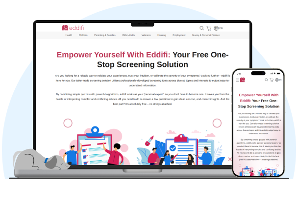
We redesigned key informational and conversion-focused pages for Eddifi, an initiative powered by Assessforce’s low-code/no-code platform. Our team crafted pixel-perfect Figma designs and translated them into responsive HTML and CSS, enhancing clarity and usability across pages, all while aligning with Eddifi’s focus on privacy, legitimacy, and user empowerment.
The Business Needs
Understanding the Needs of Eddifi
Eddifi approached us with a clear goal: to redesign its high-value informational pages for better engagement, intuitive navigation, and stronger brand resonance. As a platform designed to help users privately explore personal concerns, from health to career and social well-being, Eddifi needed an interface that conveyed professionalism, trust, and compassion.
They wanted specific pages, like “About Us,” “Become a Partner,” and “White Label Eddifi,” to feel less like static content and more like interactive, thoughtfully structured experiences. Cluttered layouts, inconsistent design elements, and outdated visuals were hindering engagement.
Our task was to create a user experience that could effectively communicate Eddifi’s values of empathy, privacy, and education, without overwhelming the user. Our solution wouldn’t just be design-deep; it needed to be human-centered. We aimed to blend minimal design with maximum impact, improving how users engage with content while building credibility at every touchpoint.
About Our Client: Eddifi, backed by a U.S.-based parent company, Assessforce, is a unique digital platform that promotes anonymous, self-guided learning and self-screening. Built with Globain’s low-code infrastructure, Eddifi enables users to explore sensitive personal topics through a secure, judgment-free environment.
Our Approach
Translating brand values into functional, human-first design
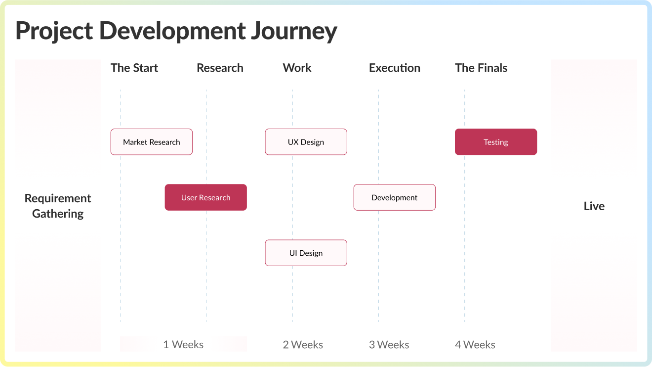
We kicked off the engagement by aligning closely with Eddifi’s leadership and internal UX team to understand their expectations, tone, and target audience. Through a series of workshops and UI/UX discussions, we learned that the visual language had to strike a balance between simplicity and supportiveness.
The first step was auditing the existing interfaces. We identified gaps in layout clarity, content hierarchy, and mobile responsiveness. Next, our design team created high-fidelity wireframes in Figma that emphasized whitespace, structured typography, and logical flows.
Each component was built around Eddifi’s user journey, from the first scroll to final interaction, making information easy to find and act upon. Our front-end developers took these designs and turned them into responsive HTML and CSS code using semantic best practices. By forgoing dynamic features in favor of performance and stability, we ensured fast load times and cross-device compatibility.
Our QA team ran rigorous tests to validate accessibility, responsiveness, and consistency across browsers and screen sizes. In essence, our approach ensured that every pixel and paragraph served a purpose, supporting Eddifi’s mission to educate and empower through clear and confidential digital experiences.
The Solution
Designing with purpose: informative, trustworthy, and scalable web pages
We redesigned and implemented a user-centric, spiritually aligned WordPress website to strengthen the online presence of Unity Path Church. Our key deliverables included:
Each redesigned page was built with storytelling in mind, guiding users from awareness to engagement in a seamless, flowing process. Here’s how we delivered a future-proof front-end solution:
1. Comprehensive UI/UX Redesign
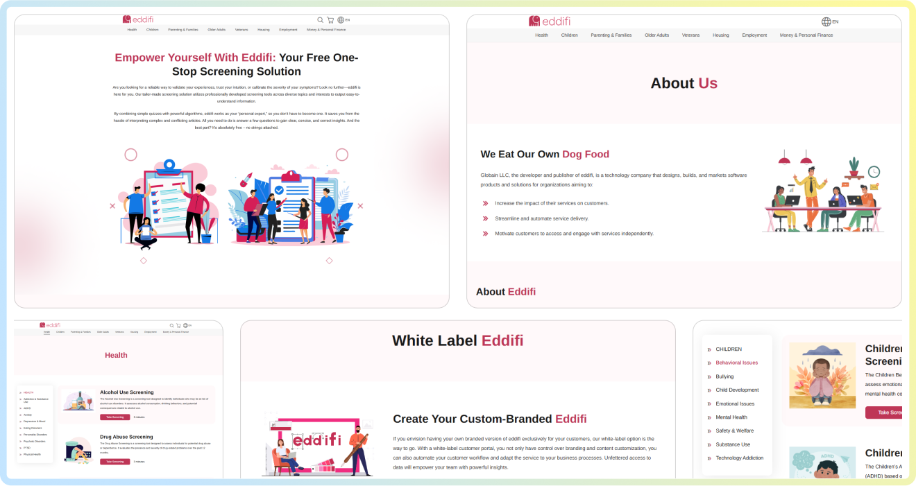
We reimagined the “About Us,” “Become a Partner,” “Contact Us,” and other pages to better reflect the core narrative. Every page was designed to build an emotional connection and brand trust.
2. Trust-First Design System
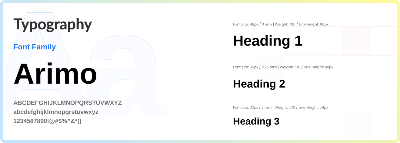
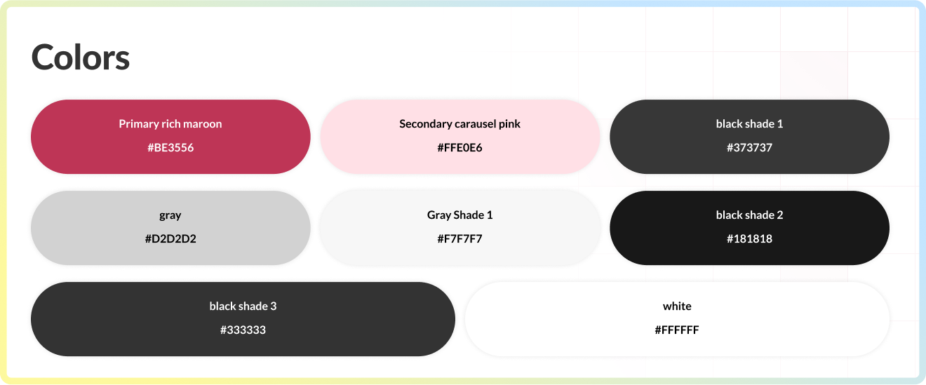
A consistent color palette, clean fonts, and visually aligned elements now provide a unified brand feel. Spacing, alignment, and visual anchors were used to reduce cognitive load and increase information retention.
3. Content-Aware Structuring
We worked with Eddifi’s team to organize content into digestible blocks. Subheadings, visual dividers, and subtle CTAs guide users while supporting their desire for privacy and control.
4. Pixel-Perfect HTML/CSS Implementation
Our developers translated Figma prototypes into clean, responsive HTML and CSS. The code was optimized for fast loading and future maintenance, with reusable components that support scalability.
5. Privacy-Respecting User Experience
With privacy at the forefront, we implemented frictionless forms, simple navigational patterns, and unobtrusive CTAs that empower users to act on their terms.
6. Mobile-Optimized Interface
From smartphones to desktops, each screen adapts effortlessly, ensuring that users always enjoy a smooth and high-quality experience, regardless of the device they use.
So the platform turned into a trustworthy, easy-to-navigate platform that meets the needs of modern users seeking guidance, education, and connection, without compromising on anonymity or accessibility.
Features
The new Eddifi site offers:
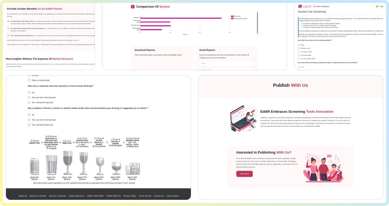
Screenshots
A glimpse into Eddifi’s fresh, future-ready design.


Trusted Voices – Hear From Our Partners
Words from those who chose us
Final Outcome
The refreshed Eddifi platform is more than just a visual upgrade; it’s a functional evolution. With new front-end pages coded directly from Figma designs, the platform is faster, cleaner, and more aligned with Eddifi’s commitment to privacy-first learning and self-discovery.
This redesign lays a solid foundation for future platform upgrades, built on clean code and modular components. Whether Eddifi decides to add new pages, tools, or partner content, the foundation is now in place for seamless scalability. With every page crafted intentionally, users can feel seen, safe, and supported.


