Mobile-Responsive Customization That Fuels Performance Growth
We create mobile-friendly WordPress websites that provide smooth, high-performance experiences across any device. Each aspect is optimized for speed, simplicity, and readability. Connect with your audience seamlessly and convert mobile visits into long-term relationships.


Optimized Mobile Designs for Superior User Engagement
AddWeb Solution provides mobile-optimized WordPress themes that balance performance and aesthetics. We add value to every mobile experience with quick loading, seamless navigation, and device-responsive layouts. Create more engaging interactions and accelerate growth with a mobile-first approach.

AddWeb Solution’s Adaptive Mobile Customization That Drives Results
Our customized solutions boost user interaction, improve conversions, and provide smooth functionality, making your WordPress website shine in the mobile-first world and achieve real business success.

Mobile-First Strategy
Right from the start, we emphasize mobile responsiveness so that your WordPress site is perfectly optimized for small screens without sacrificing user experience. Our mobile-first strategy guarantees fast, intuitive, and delightful interactions for mobile users with a seamless browsing experience.

Cross-Device Experience
We guarantee your WordPress site delivers a unified experience on desktops, tablets, and smartphones. By easily shaping your design and content to each other, we provide a unified user experience no matter the device.

Intuitive Navigation
Our WordPress mobile templates offer great, simple navigation mechanisms on your smartphone. Friendly, easy-to-view menus and uncomplicated options assist users efficiently with navigating your site, finding things quickly, and getting the help they need effectively.

Mobile SEO Optimization
Our mobile-friendly WordPress sites are optimized for the best SEO practices to increase your site’s ranking in mobile search. By giving mobile SEO the highest priority, we boost your site’s visibility and likelihood of ranking higher, attracting more organic traffic, and more exposure for your business.

Adaptive Layouts for Every Size
Our responsive WordPress themes seamlessly adapt to various screen sizes so that your website appears excellent and operates flawlessly on any device. Whatever the device- smartphone, tablet, or desktop- the design responds to the best viewing and interaction experience.

Consistent Branding
We keep your brand consistent on all screen sizes, so your WordPress website consistently portrays a professional image regardless of your users’ devices. This inspires trust and familiarity while providing an easy-to-use experience to all visitors.

Data-Driven Design
We regularly review performance data and user feedback to update and enhance your mobile-friendly WordPress theme. Your site is updated through data-driven decisions according to user activity, resulting in increased engagement, conversions, and long-term growth.
What Our Client Says About Mobile-Responsive Customization Service
4.8

46 reviews
4.5

 Verified Review
5.0
Verified Review
5.0

Verified Review
5.0
Verified Review
5.0
Verified Review
Mobile Optimization for WordPress That Captivates and Converts
Our responsive designs make your site behave perfectly on all devices, making users stay for longer. The outcome is quicker conversions and more business success.
- Clear Hierarchy
- Touch-Friendly UI
- Faster Mobile Loading
- Browser Compatibility Assurance
At AddWeb Solution, we make your WordPress site mobile-friendly for a worry-free mobile experience. Our responsive designs make your site behave perfectly on all devices, making users stay for longer. The outcome is quicker conversions and more business success.

Menus and buttons are redefined to offer seamless, trouble-free mobile surfing. We design intuitive, touch-based interfaces that function beautifully on small screens. This invites users to discover more and minimizes friction in their path.

We test your WordPress website on mobile devices to ensure flawless display and functionality. All devices, from the newest iPhone to Android, are included. This provides a smooth, uniform experience regardless of screen size or browser.

We increase mobile loading speed by optimizing images, file compression, and reducing scripts. A speedy site translates to a quality user experience and reduced bounce rates. Additionally, faster loading enables your WordPress website to rank higher in search results.
Mobile-Responsive Customization That Adapts, Performs, and Converts
With our mobile-responsive customization, your digital platform adjusts effortlessly to any screen size, delivering a consistent, intuitive experience that keeps visitors engaged and coming back. From flexible grids to touch-optimized interfaces, we ensure that your design fits-but feels natural- across every device.
We go beyond just “fitting the screen.” Our approach focuses on real performance-minimizing load times, optimizing media, and fine-tuning UI elements for mobile behavior. We consider everything: thumb zones, swipe gestures, font scaling, and responsive menus. The result is a mobile-friendly interface engineered to boost engagement, reduce bounce rates, and increase conversion, so your brand grows, one tap at a time.


Expert Developers

Web Solution Delivered

Years of Experience
Risk-free 15 Days Trial


+91-903-317-7471
Our Mobile-Responsive Customization Portfolio
Discover our portfolio of mobile-friendly websites, crafted for smooth experiences on every device. Every project showcases our proficiency in developing intuitive navigation and performance optimization, guaranteeing outstanding user engagement and effective results.
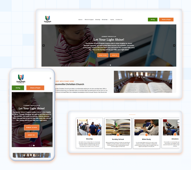
Unity Path
We revamped Unity Path Church’s website for better usability, visibility, and engagement. Built on WordPress 6.7.3 with the FSE Spiritual theme and hosted on WeWP, it now features smooth navigation, prayer requests, event booking, and contact forms to strengthen community connection.
Leeco
How we implemented strategic improvements that allowed Leeco to maintain seamless functionality and elevate user experience. Our proactive partnership has positioned Leeco to continue thriving in the competitive fencing and decking market, ensuring they remain a trusted choice for customers in Ireland.

Elevate Your WordPress Experience with Mobile Customization
We design mobile-friendly WordPress websites optimized for optimal performance on any device. Our mobile-first approach blends speed, simplicity, and seamless interaction to captivate users.


User-Friendly Pathways
We optimize your WordPress website navigation for a seamless, intuitive experience across any device. Users instantly find what they’re looking for from simple, touch-intuitive menus and cleanly organized layouts. This frictionless browsing keeps them interested and leads to more extended site visits.

Enhanced Visual Layouts
We refine your WordPress website to perfectly scale on all screen sizes, presenting a professional look. Layouts, images, and fonts automatically scale for the optimal viewing experience. This ensures a compelling, operational design on any device.

Touch-Friendly Interfaces
Your WordPress website will have touch-friendly buttons and interactive features, making navigating and filling out forms easy. Mobile-optimized design increases user satisfaction and engagement. A responsive interface provides a smooth, pleasant experience on any device.

Responsive Mobile Menus
Menus are fully responsive, adapting to mobile screens while maintaining functionality. Users can effortlessly find what they need with clear labels and easy navigation. This encourages more exploration and enhances user interaction on your site.

Mobile E-commerce Experience
Our mobile personalization involves maximizing your e-commerce website for mobile buying. We simplify the buying process, which makes it more convenient for customers to navigate through products, place items in their cart, and check out smoothly. This leads to an improved mobile buying experience and increases sales.

Engaging Content for Mobile Users
We ensure your WordPress website content is viewable on mobile phones, with readable text and ideally sized images. Mobile-optimized content prompts users to interact more with your site by reading articles or watching videos. This translates into greater user retention and interaction.
Our Mobile-Responsive Customization Insights
Improve your WordPress website’s mobile experience by solving user pain points with simple solutions. Mobile-responsive design provides smooth performance on all devices. A professional touch brings your vision to life, fueling growth and engagement.


Frequently Asked Questions
Find answers to the most common queries about Mobile-Responsive Customization services.
Mobile-responsive customization makes your WordPress website responsive to different devices, offering a seamless, user-friendly experience on smartphones, tablets, and desktops.
A mobile-friendly design maximizes user experience, minimizes bounce rates, and improves SEO rankings by making your site beautiful and functional on all devices.
It makes your site mobile-friendly, enhancing loading time, navigation, and readability, resulting in more extended visits and improved conversion rates.
Depending on the complexity of your site, the period varies; nonetheless, it ranges between a few days and a couple of weeks for completely implementing mobile-responsive customization.
Mobile-responsive design is concerned with formatting the site layout across varying screen sizes, whereas mobile optimization improves speed, performance, and mobile-specific search engine optimization.
It enhances loading speed, ease of navigation, and cross-device compatibility, eventually affecting the performance and bounce rates.
Yes, mobile-responsiveness increases SEO since Google favors mobile-friendly websites, increasing search engine ranking and organic traffic.
Mobile-friendly themes are the fundamental platform; custom mobile-responsive solutions tweak your site’s performance and optimize it for the kind of audience you have and your brand.
