


Today, websites and tools play a vital role. Is it possible to imagine the world of web development without CSS? The answer is: No! Many tools and frameworks are available for web designers and developers to create user-friendly and browser-compatible websites and web pages. Whether an experienced developer or a fresher, you must have heard about two CSS frameworks – Bootstrap and Tailwind CSS.
While Bootstrap is a component-based framework, Tailwind CSS is a Utility-first framework. Both frameworks offer designers a set of features and benefits. The primary or noticeable difference between Bootstrap and Tailwind CSS is that Bootstrap offers pre-made components that can help designers build websites or apps quickly, while Tailwind CSS requires you to create such components on your own.
Before we start digging, let’s define a CSS Framework and why we use it. A CSS framework is a collection of CSS style sheets that are prepped and ready to use.
Why use CSS frameworks?
- Speeds up your development
- Enables cross-browser functionality
- Ready-to-use classes
- Pre-defined styling rules
- Pre-built components
Let us take a tour to scrutinize the difference between Bootstrap and Tailwind CSS and try to give you the possible perception of this topic, which will help you determine which one is best for your next project.
Bootstrap
Bootstrap is the most popular HTML, CSS, and JS framework for developing responsive, mobile-first projects on the web. It is a free and open-source CSS and JavaScript/jQuery code for creating dynamic layout websites and web applications. Being a tool for creating front-end design templates for different website components such as a carousel, modals, dropdowns, accordion, and other valuable components with the help of JavaScript. Whether you are fresher or experienced, all these powerful components will help you build any website in less time.
The Bootstrap team has taken considerable steps to make the framework lightweight, simple, functional, and faster for the developer’s benefit, and the community has launched a new version. Bootstrap 5 has been released with significant updates like no jQuery, lots of new icons, and similar to Tailwind CSS concept of Utility.
Below are some significant updates you can see in Bootstrap 5:
- New logo
- New off-canvas component
- New accordion
- New and updated forms
- Added RTL
- Overhauled utilities
- jQuery was removed
- Switch to Vanilla JavaScript
- Responsive Font Sizes
- Drop Internet Explorer 10 and 11 support
- Change of gutter width unit of measurement
- Removed Card Decks
- Navbar Optimization
- Custom SVG icon library
- Class updates
Tailwind CSS
Tailwind CSS has recently benefited from an upward trend of popularity. Many front-end developers stick with the new CSS Framework as a new alternative.
Websites made using Tailwind are more versatile, customizable, and lightweight than Bootstrap.
This framework is utility-based, which means that it is a low-level framework. It does not have a library of pre-designed components like a carousel, modal buttons, etc. Instead, it has pre-written classes like margins, paddings, font size, etc.
In Tailwind CSS, you need to write more code to make a component than Bootstrap; you will not get any pre-built JavaScript functionality.

Enhance User Experience: Discover how Bootstrap or Tailwind CSS can improve your website’s usability.

Pooja Upadhyay
Director Of People Operations & Client Relations
What is TailWind CSS?
TailWind CSS is a utility-first CSS framework that allows developers to quickly design and customize responsive websites by providing pre-built components and utility classes. It is known for its low-level utility classes, which give developers complete control over the design and layout of their websites.
TailWind emphasizes a highly customizable approach, encouraging developers to shape the framework to their project’s specific needs. The framework focuses on enabling developers to write CSS directly within HTML markup, streamlining the development process and reducing the need for numerous custom stylesheets.
One of TailWind’s core principles is its responsive design philosophy. It uses a mobile-first approach and includes responsive variants for each utility class, making it easy to adjust designs for different screen sizes.
TailWind’s popularity has grown due to its emphasis on performance. The framework generates minimal CSS, leading to faster page load times and an improved user experience.
Benefits of TailWind CSS vs. Bootstrap
When to Use Bootstrap?
Bootstrap is an excellent choice for beginners or developers who want to quickly build a website with pre-designed components and a grid system. It is also a fantastic option for prototyping or creating a minimum viable product (MVP).
Bootstrap can expedite the development process for projects with tight deadlines where time is of the essence, thanks to its ready-to-use components. This means developers can focus on functionality rather than spending time on design details.
Bootstrap is also beneficial for teams with varying design and development skills. Its comprehensive documentation and community support make it easier for less experienced team members to contribute effectively.
In scenarios where consistency is crucial, such as in large projects or enterprises, Bootstrap’s uniform components can ensure a coherent look across different parts of the application or other applications within the same ecosystem.
When to Use TailWind CSS?
TailWind CSS is best suited for experienced developers who want complete control over the design and layout of their website. It is also an excellent choice for projects that require customization and unique designs.
Suppose your project demands a highly tailored design that deviates from standard UI patterns. In that case, TailWind CSS provides the flexibility needed to build bespoke user interfaces without the constraints of pre-designed components.
TailWind CSS is also an excellent choice for projects where performance is crucial. Since it doesn’t include a bulky set of components by default, the final CSS bundle is typically smaller, resulting in faster loading times.
For developers who prefer a more hands-on approach to styling and enjoy building a design system from scratch, TailWind’s utility-first philosophy aligns perfectly with this methodology.
TailWind CSS & Bootstrap Similarities
How Are TailWind CSS and Bootstrap Similar?
TailWind CSS and Bootstrap are both CSS frameworks that provide a foundation for building responsive websites. Here are some key similarities between the two:
- Both frameworks use a grid system to help developers create responsive layouts.
- They both offer a set of pre-designed components that can be used to create a website quickly.
- Both frameworks are open-source and have a large community of developers.
- They both offer a mobile-first approach, ensuring that websites are optimized for mobile devices.
- They both support the latest web development trends and technologies.
Despite their differences in design philosophy, both frameworks aim to make web development more efficient and accessible. They each provide tools that can help streamline the process of creating websites that work across all browsers and devices.
Both TailWind CSS and Bootstrap emphasize the importance of a responsive design. They offer built-in functionality to ensure that web pages render well on different screen sizes, which is essential for modern web development.
The communities surrounding TailWind CSS and Bootstrap contribute to their ongoing development and provide a wealth of knowledge for troubleshooting and learning. This means you’ll have access to support and resources no matter your chosen framework.
Key Advantages of Using Bootstrap
Ease of Use
Bootstrap’s pre-designed components and grid system make it easy to create a responsive website quickly. The framework focuses on simplicity so new developers can learn it without a steep curve.
Bootstrap’s class-based system offers a straightforward way to apply styling for those unfamiliar with advanced CSS techniques. This means less time spent learning CSS intricacies and more time building the actual website.
The framework includes a variety of templates and examples that can serve as a starting point for most web projects. By using these templates, developers can understand best practices and how to structure their pages effectively.
Bootstrap’s pre-built themes allow for rapid visual customization. Whether you want to adhere to a corporate colour scheme or change the look and feel of a site, Bootstrap themes can be easily modified to fit your needs.
Well-Documented
Bootstrap has extensive documentation, making it easy for beginners to get started. The official documentation is comprehensive and includes detailed explanations of each component and how to use them.
The examples provided in the documentation can be copied and customized, giving developers a hands-on way to learn and understand the framework. This is especially useful for visual learners who benefit from seeing code in action.
Tutorials and guides created by the community complement the official documentation, offering additional insights and tips. These resources can be invaluable for deepening their understanding or troubleshooting specific issues.
Since Bootstrap is so widely used, there are many forums and discussion boards where developers can ask questions and share knowledge. This community support can be a lifeline when encountering complex challenges during development.
Responsive Design
Bootstrap’s mobile-first approach ensures that websites are optimized for all devices. This means developers start designing for the smallest screens and then progressively enhance the design for larger screens.
The built-in grid system is a critical feature that enables responsive layouts. Developers can specify how elements should resize and reposition on different devices, making the website accessible and user-friendly regardless of the viewing context.
Bootstrap also includes responsive utility classes that provide additional control over the visibility and behaviour of elements at various breakpoints. These classes can be applied to show or hide content based on the screen size.
Media queries, a fundamental part of responsive design, are handled seamlessly by Bootstrap’s framework. This abstraction allows developers to focus on the content and structure rather than the complexities of CSS media queries.

Large Community
With a vast community of developers, Bootstrap has many resources and support available. This community is an invaluable asset for both learning and troubleshooting.
The large user base means others have already encountered and solved many common issues. As a result, a quick search can often lead to ready-made solutions or advice from fellow developers.
The community also contributes to a rich ecosystem of third-party tools and plugins that extend Bootstrap’s functionality. These contributions can save time and add sophisticated features to a website with minimal effort.
Events, conferences, and meetups dedicated to Bootstrap provide opportunities for networking and learning from experts in the field. These gatherings can be a great way to stay up-to-date with the latest trends and best practices.
Browser Compatibility
Bootstrap is compatible with all modern browsers, ensuring that your website looks great for all users. The framework handles browser-specific quirks and provides a consistent experience across different platforms.
Bootstrap’s development team actively monitors and fixes browser compatibility issues as they arise. This means developers don’t worry as much about testing and tweaking their code for various browsers.
Using well-established CSS and JavaScript standards in Bootstrap ensures that websites remain functional and accessible even as web technologies evolve. This forward compatibility is crucial for maintaining sites over time.
By abstracting away the complexities of cross-browser compatibility, Bootstrap allows developers to focus on building the website rather than dealing with the inconsistencies of different browsers.
Benefits of Using TailWind CSS
Complete Control
TailWind’s low-level utility classes give developers complete control over the design and layout of their website. This granular control allows for the creation of custom designs that are not constrained by pre-defined components.
Developers can mix and match utility classes to achieve their desired look. This approach to styling encourages a more thoughtful design process where every element can be finely tuned.
TailWind’s focus on utility classes allows developers to avoid the often cumbersome process of overriding styles in traditional CSS frameworks, leading to cleaner and more maintainable codebases.
The utility-first approach fosters the development of a unique design system tailored to the project’s specific needs. It can also facilitate better collaboration between designers and developers, as they can easily translate design specifications into code.
Customization
TailWind CSS allows developers to customize every aspect of their website, making it an excellent choice for projects that require unique designs. The framework’s configuration file lets developers define design tokens like colors, fonts, and spacing.
TailWind’s plugin system allows for the addition of custom utilities and components. This means developers can extend the framework’s core functionalities to include whatever they need for their project.
The framework is designed to be purged of unused CSS, ensuring that only the styles used in the project are included in the final build. This results in a lean and efficient stylesheet specific to the website.
Developers can use TailWind with pre-processors like PostCSS to unlock even more customization options. This combination can lead to powerful workflows that optimize development time and performance.
Lightweight
Unlike Bootstrap, TailWind does not come with pre-designed components, making it a lightweight framework focusing on utility classes. This minimalist approach ensures the final CSS bundle is as tiny as possible.
The absence of pre-designed components means the CSS file is free of unnecessary bloat. This can significantly improve page load times, critical factors in user experience and search engine optimization.
TailWind’s just-in-time (JIT) mode compiles CSS on the fly, only generating styles for the classes used in your HTML. This can drastically reduce the size of the CSS file, especially for large projects.
TailWind’s lean nature makes it an excellent choice for projects where performance is a priority. The smaller CSS file size can particularly benefit mobile users with limited bandwidth.
Faster Development
TailWind’s utility classes allow developers to write less code, making the development process faster and more efficient. By applying styling directly within HTML, developers can avoid context-switching between HTML and CSS files.
The utility-first approach can lead to rapid prototyping, as developers can see the effects of their styling changes in real time. This can accelerate the feedback loop and help iterate on designs more quickly.
TailWind’s design encourages a “write less, do more” philosophy. Compared to traditional CSS, developers can achieve complex designs with fewer lines of code, speeding up both development and debugging.
Because TailWind provides a consistent set of utility classes, it can help standardize coding practices across a team. This can improve collaboration and a smoother development process, especially in larger teams.
Mobile-Friendly
TailWind’s responsive design ensures that websites are optimized for all devices. The framework’s mobile-first utilities make building websites that perform well on small screens straightforward.
Responsive modifiers in TailWind CSS allow developers to adjust styles based on the current breakpoint quickly. This flexibility is crucial for creating interfaces that adapt to various device sizes.
TailWind CSS provides a consistent and intuitive system for handling spacing, sizing, and other responsive design aspects. This system reduces the learning curve for creating mobile-friendly designs.
The framework’s emphasis on performance also benefits mobile users. With faster loading times and optimized styles, TailWind-powered websites can offer a superior experience on mobile devices.
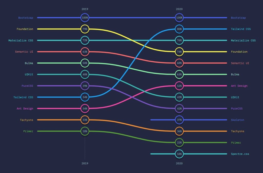
Some Stats
Here are some statistics based on Satisfaction, interest, usage, and awareness ratio rankings.
If you see the below graphs, you can see Tailwind CSS satisfaction and interest area have dramatically increased in the past two years while Bootstrap is still leading in Usage and Awareness.
- Satisfaction
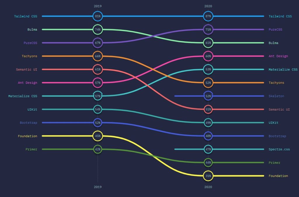
Interest
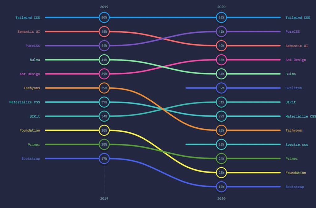
Usage
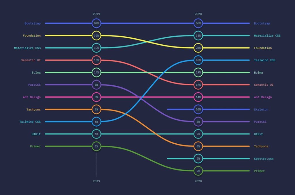
Awareness
Support
Bootstrap has been used by many developers for more than 10 years and hence, become the most popular CSS. You can get countless support from Stackoverflow threads if you have specific situations.
On the other hand, Tailwind CSS doesn’t have a large community compared to Bootstrap. However, it is growing daily by increasing its tools.
So, which one to pick?
In my perception, Bootstrap or Tailwind CSS is based on your preference and the kind of website you want to build. If you’re going to minimize your work and enjoy the predesigned components, you will go for Bootstrap. On the other side, go for the Tailwind CSS if you want to customize the project independently.
Based on the discussion, Tailwind CSS is preferable if you are looking for faster front-end development. But if you are targeting responsive design, Bootstrap is all that you need. Bootstrap helps you eliminate writing browser-specific code regarding browser compatibility, but nothing much is available with Tailwind CSS. Bootstrap is a good choice for making responsive and high-quality-looking websites with minimal effort. Tailwind CSS is better for more customized and unique-look projects.
Frequently Asked Questions
It’s like choosing between ready-made furniture and custom designs. The debate centers around the preference for a pre-designed, opinionated framework like Bootstrap versus the flexibility and customization offered by the utility-first approach of Tailwind CSS.
Think of it as learning to cook. Bootstrap is often considered more beginner-friendly due to its pre-built components and straightforward documentation. Tailwind CSS has a steeper learning curve, but some find its utility classes empowering for customization.
It’s like comparing a fixed menu to à la carte options. Bootstrap provides a set menu of components, while Tailwind CSS offers à la carte customization with utility classes. Tailwind CSS is considered more flexible for design customization.
It’s like choosing the right tool for construction. Bootstrap is often preferred for large-scale projects where consistency and rapid development are crucial. Tailwind CSS, with its utility-first approach, can also scale effectively for projects requiring high customization.
Think of it as ensuring your message is clear in different languages. Both Bootstrap and Tailwind CSS are designed to be responsive and are compatible with modern browsers. They provide tools and classes to create responsive and mobile-friendly designs.
Think of it as a guide versus a blank canvas. Bootstrap is more opinionated, providing a set of predefined styles and components. Tailwind CSS, being utility-first, is less opinionated, allowing you to define styles and design elements from scratch.
Absolutely! It’s like combining different ingredients in a recipe. While it might be unconventional, some developers use both Bootstrap and Tailwind CSS in the same project. Bootstrap for pre-built components and Tailwind CSS for additional styling and customization.
It’s like choosing your preferred style of clothing. Consider factors such as project requirements, design preferences, ease of use, and the learning curve. Bootstrap may be suitable for rapid development, while Tailwind CSS offers more customization options.
Make the Right Choice: Make an informed decision between Bootstrap and Tailwind CSS for your next project.
Pooja Upadhyay
Director Of People Operations & Client Relations