

At Webflow Conf 2025, a fundamental shift in how designers and developers approach scalability was announced, with the introduction of the Component Canvas, AI-powered tools, and a next-gen CMS capable of handling 1 million items. These aren’t incremental updates – they represent a reimagining of what’s possible in no-code and low-code environments. This comprehensive analysis examines how Webflow’s new component architecture is reshaping design system practices, driving measurable business ROI, and establishing accessibility as a foundational principle rather than an afterthought.
“True success of a design system doesn’t simply lie in widespread adoption. It lies in the effective organization of work processes and how the design system team participates in the ideation phases of a product.” — Dan Mall, Founder of Design System University
Understanding Component Architecture in Modern Web Design
Component-based architecture has become the architectural standard for modern web development. React, which pioneered this approach, now powers 45.8% of the JavaScript library market with over 20 million weekly downloads as of September 2024. The concept itself involves breaking down user interfaces into smaller, independent, reusable building blocks – each with a clear interface, defined responsibilities, and the ability to function independently while also working together as part of a larger system.
The business case is compelling. Teams implementing proper component systems see 60% faster development times compared to monolithic architecture. This isn’t theoretical—when designers stop duplicating work, developers avoid rewriting the same code, and product teams ship features faster, the gains are immediate and measurable. Sites built with React render 15-20% faster than sites using other JavaScript libraries, which directly impacts search engine rankings through Google’s Core Web Vitals metrics.
However, implementing design systems at scale presents significant challenges. According to research presented at Webflow Conf, 52% of teams cite adoption as their biggest evolution challenge when implementing design systems. The technical work of creating components is straightforward. The hard part involves governance, documentation, team buy-in, and maintaining consistency as products evolve. Understanding this distinction – between building a design system and successfully deploying one – is critical to understanding why Webflow’s announcements matter.
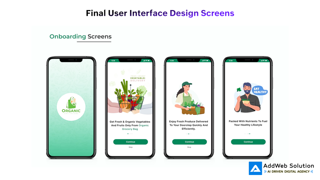
Onboarding screens for an organic grocery delivery app showcasing clean, user-friendly UI design for new users
Webflow Conf 2025: The Key Announcements That Matter
Webflow’s 2025 conference addressed core pain points in design system management through several interconnected announcements that merit individual examination.
The Component Canvas: Transforming Design System Governance
The Component Canvas represents the most significant quality-of-life improvement for design system managers. Previously, editing components in Webflow required placing them on a page and managing them in that context. The new Component Canvas provides a dedicated space – similar to Figma’s environment – where all component variants appear side by side and can be edited independently.
This matters because design systems are living entities requiring constant refinement. Design system managers adjust spacing, refine color palettes based on accessibility feedback, manage component variants (disabled, loading, error states), and ensure consistency across dozens of interconnected components. The Component Canvas eliminates cognitive friction by providing focused, distraction-free editing. For enterprise teams managing 100+ components across multiple products, this workflow improvement dramatically reduces both development time and error rates. A dedicated interface for components creates a shared mental model between designers and developers, mirroring established workflows in tools like Figma.
Next-Generation CMS: Enabling True Scalability
The previous Webflow CMS had inherent limitations that constrained scalability. Enterprise customers quickly hit ceilings when managing large data models. The new CMS introduces architectural improvements that fundamentally change what’s possible:
- 1 million CMS items for Enterprise customers (addressing previous limitations)
- Up to 40 collection lists per page (expanded from previous restrictions)
- 3 levels of deep nesting for complex data models (increased from limited options)
- Doubled reference fields for interconnected, relational content
These improvements matter because scalable design systems aren’t purely about components—they’re about content architecture. When the CMS can handle complex data models, design system components can pull real, dynamic content from a database, transforming every instance from a template into a truly dynamic component. This architectural foundation enables what Webflow calls “1:1 components”—every instance is a real, data-backed component rather than a visual copy.

A visual representation of reusable UI components in a design system, including colors, typography, buttons, icons, and calendar elements
Code Components: Bridging No-Code and Professional Development
Code Components represent a strategic bridge between visual design and professional software development. Developers can build React components and use them directly on the Webflow canvas, while designers maintain visual authorship without requiring React expertise. This approach eliminates a false choice between ease-of-use and functionality. Teams get both.
For organizations building complex web applications, this means leveraging Webflow’s visual interface while accessing the full power of React’s ecosystem for advanced logic, state management, and custom interactions.
AI-Powered Features and Accessibility Compliance
Webflow’s AI assistant functions as a conversational partner helping teams orchestrate complex tasks. The most immediately practical feature involves AI-powered SEO tools that automatically generate alt text, schema markup, and metadata. This isn’t luxury functionality – it’s essential for regulatory compliance.
The European Accessibility Act takes effect in June 2025. WCAG 2.1 compliance is mandatory for all digital products and services in the EU. Similar regulations are rolling out in the US and other regions. Components built without proper accessibility features aren’t scalable – they’re regulatory liabilities. Webflow’s AI tools help teams achieve compliance by default, building accessibility into components from inception rather than retrofitting it later.
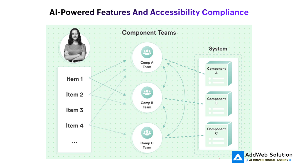
Component teams managing distinct system components collaboratively in a modular architecture setup


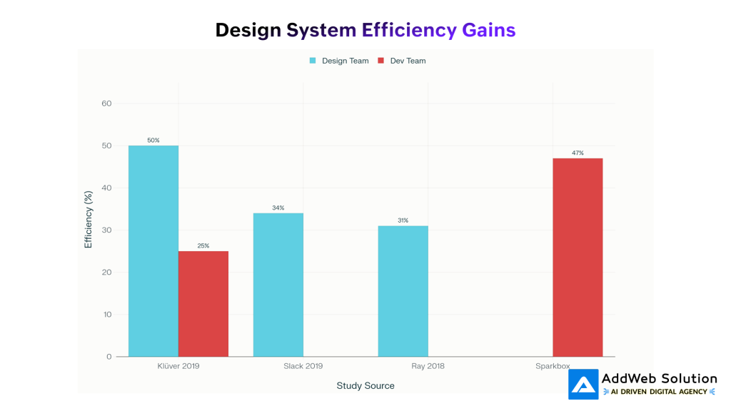
The Business Case: Quantifiable Returns from Design Systems
The ROI of design systems has historically been difficult to quantify. However, recent research provides concrete metrics:
Design Team Efficiency Gains:
- Klüver (2019): 50% productivity improvement
- Slack (2019): 34% productivity improvement
- Ray (2018): 31% productivity improvement
Development Team Efficiency Gains:
- Sparkbox: 47% productivity improvement
- Klüver (2019): 25% productivity improvement
Technical Performance Gains:
- Component reusability improves 30% with AI-powered code analysis
- Bug fix frequency decreases 25% through AI-powered code analysis
- React development velocity increases 60% with component architecture versus monolithic code
Beyond productivity metrics, design systems drive business impact through multiple channels:
- Accelerated Time-to-Market: Pre-built, tested components eliminate development effort for common UI patterns. A SaaS company that adopted a design system accelerated releases by 40%—not marginal improvement, but transformational business impact.
- Consistent User Experience: Users develop trust and brand recognition through design consistency. Brands that maintain visual consistency see measurable improvements in user engagement and conversion rates.
- Reduced Maintenance Burden: Fixing a component once fixes it everywhere it’s used, dramatically reducing maintenance costs across product suites.
- Cross-Functional Collaboration: Design systems create a shared language between designers, developers, product managers, and stakeholders, reducing miscommunication and rework.
- Organizational Scalability: The same team size can support larger product portfolios with better quality when operating through a design system.

- Developer Framework Preferences & Positive Experience Rates (2024-2025)
Measuring Design System Success: Adoption Metrics That Matter
Design system adoption shouldn’t be measured simply by counting component usage. Sophisticated teams employ more nuanced metrics that reveal actual impact:
| Metric Category | Measurement Approach | What It Reveals |
| Component Adoption | DS Component Adoption % = (Nodes from DS / All Nodes) × 100 | Actual system usage in live designs |
| Component Quality | Accessibility Score, Core Web Vitals, Code Quality | Whether adoption increases with quality |
| Component Usage Pattern | Most/Least Used Components | Which components work; which need improvement |
| System Integrity | Detached Instances Ratio | When designers bypass the system |
| Adoption Barriers | Homebrew Components Created Outside System | Where the design system has gaps |
| Time Savings | Hours Saved Per Project | Productivity impact quantification |
| Maintenance Burden | Cost Per Bug Fix | Long-term cost reduction impact |
Healthy design systems achieve 70%+ adoption within the first six months. Below 50% adoption indicates fundamental adoption barriers- typically governance issues, insufficient component coverage, or poor documentation.
AI and Accessibility: The Legal Requirement Meets Technical Excellence
Accessibility in 2025 operates simultaneously as both a moral imperative and a legal requirement. The landscape has shifted dramatically:
Regulatory Requirements:
- European Accessibility Act (EAA): June 2025 deadline mandates WCAG 2.1 Level AA compliance
- Americans with Disabilities Act (ADA) Update: Requires state and local government websites to be accessible by April 2026-2027
- Colorado HB-21: State-level accessibility requirements taking effect July 1, 2025
Technical Insight:
Research reveals that 67% of accessibility issues originate during the design prototype stage, not in development. This means design systems that embed accessibility from inception catch issues when they’re easiest and cheapest to fix. When a button component is designed with proper focus states, sufficient color contrast ratios, and keyboard navigation built-in, every instance of that button is accessible automatically.
Scaling this principle across 50 components means an entire product suite becomes accessible without additional engineering effort. However, this requires discipline- components must be designed and documented with accessibility requirements visible to the design team. Pinterest integrated accessibility checklists directly into Figma, making compliance requirements contextual rather than external.
React’s Dominance in Component-Based Development
React’s market position reflects broader industry acceptance of component-based architecture:
- 43.21% of developers report positive experience with React (highest among frameworks)
- 30% positive experience with Angular
- 18% positive experience with Vue.js
This rating distribution isn’t accidental. Developers trust React because it solves real problems- component reusability, predictable state management, performance optimization, and a mature ecosystem of supporting libraries. The success rate reflects both technical merit and ecosystem maturity.
Implementation Challenges and Navigation Strategies
Building scalable design systems encounters predictable obstacles that require proactive management:
Challenge 1: Adoption Resistance and Behavioral Change
The biggest threat to design system success isn’t technical—it’s organizational. Designers might prefer independent workflows. Developers might see the system as restrictive. Your solution requires demonstrating value through early wins and reducing friction.
Effective strategies include: targeted training programs, celebrating early adopter teams, showcasing time savings through concrete examples, and involving team members in component design decisions. When designers and developers have input into component design, adoption resistance decreases dramatically.
Challenge 2: Quality Maintenance at Scale
As design systems scale, maintaining quality becomes exponentially harder. More components mean more variants, more edge cases, more potential for inconsistency. Solutions include: automated accessibility testing (Axe, Lighthouse), performance monitoring, semantic versioning discipline, and regular component audits.
Webflow’s AI integration helps by automating metadata generation, alt text creation, and schema markup. However, human review remains essential for edge cases and complex scenarios.
Challenge 3: Documentation That Drives Adoption
Documentation is necessary but insufficient for adoption. Teams ignore external documentation. The solution is embedding guidelines into tools themselves. Pinterest’s approach—integrating accessibility checklists directly into Figma—demonstrates this principle. When designers see requirements in context while building, compliance becomes natural rather than punitive.
Challenge 4: Versioning Strategy and Breaking Changes
As components evolve, teams need clear versioning practices. Semantic versioning (major.minor.patch) helps teams understand implications:
- Major: Breaking changes requiring component updates across projects
- Minor: New features maintaining backward compatibility
- Patch: Bug fixes
Webflow’s enhanced component capabilities make version management easier through variant testing and staged rollouts without affecting live instances.
Real-World Impact: Component Architecture Performance Metrics
Development Speed Metrics
React-based applications render 15-20% faster than sites using other JavaScript libraries—a significant advantage in an era where Core Web Vitals directly impact search engine rankings. This isn’t academic; faster render times improve both user experience and SEO performance.
Component architecture produces measurable velocity increases. Developers spend less time solving the same problems repeatedly and more time on novel features. The rule of three—when code appears in three places, abstract it into a reusable component—reduces technical debt while improving maintainability.
Market Adoption Trends
React’s ecosystem demonstrates component-based architecture’s market validation:
- 228,000+ GitHub stars indicating active community engagement
- 46,000+ forks showing broad adoption and customization
- 20+ million weekly NPM downloads confirming production usage at scale
Accessibility Compliance Impact
Design systems that prioritize accessibility from inception require no additional compliance effort. When components are built accessibly, 100% of the product suite benefits. This creates a virtuous cycle: teams allocate resources once during component design, then benefit across the entire product portfolio indefinitely.
The Future of Design Systems: Emerging Trends
AI-Driven Component Generation
Current state: Designers create components manually. Future state: AI analyzes design language and suggests missing components, flags inconsistencies, and recommends optimizations. Webflow’s Code Components and AI assistant are early steps toward this future.
Headless Design Systems and Multi-Channel Distribution
Webflow’s Content Delivery APIs (now available to all customers) enable headless design systems where components and content live separately. Organizations can reuse components across web, mobile, email, and emerging channels.
Socio-Technical Architecture Focus
Design systems succeed when built around how teams actually work. Organizations that practice decentralized decision-making, clear component ownership, and collaborative governance outperform those using purely top-down approaches. The future involves designing systems with team dynamics in mind, not just technical ideals.
Anticipating WCAG 3.0
WCAG 3.0 is coming. It will be stricter, more user-focused, and less forgiving of edge cases than WCAG 2.1. Design systems prioritizing accessibility now will adapt easily to future requirements. Those bolting accessibility on later will struggle with retrofit complexity.
Conclusion
Webflow Conf 2025’s announcements represent more than feature releases—they signal industry recognition that design systems are transforming digital product development. When a platform adds a dedicated Component Canvas, introduces AI tools for accessibility compliance, and scales the CMS to handle 1 million items, it’s betting that design systems are the future.
The practical shift these announcements represent is profound: from “let’s build this website” to “let’s build a system that creates websites.” That distinction fundamentally changes how organizations approach digital product development.
For teams scaling their digital products, these tools matter considerably. They reduce friction between designers and developers, democratize enterprise-grade capabilities, and embed best practices by default. However, technical tools alone don’t guarantee success. Design system success ultimately depends on organizational commitment, clear communication, team adoption strategies, and ongoing measurement and refinement.
The future of scalable design isn’t about having the most components or the fanciest tools. It’s about building systems that teams actually want to use—systems that reduce friction instead of adding it, that make consistency and quality the default rather than the exception, and that support team growth without proportional complexity increases. Webflow Conf 2025 demonstrated that this future is achievable now. The remaining question is whether your organization is prepared to build it.
Ready to Redefine Your Online Presence? Start with Our Webflow Development!

Pooja Upadhyay
Director Of People Operations & Client Relations