


“Recurring donors provide predictable and sustainable revenue, smoothing out the peaks and valleys of traditional fundraising campaigns.”
Source: Virtuous – The Power of Recurring Giving for Nonprofits
Introduction
Most nonprofits lose 50–70% of donors right on the donation page. Not because people don’t care – but because something gets in the way. Too many steps, slow forms, or friction at the worst possible moment.
The encouraging part? Small fixes can make a big difference. A UK charity, Scope, increased donations by 40% simply by simplifying their form and adding options like Apple Pay and Google Pay. No fancy tech – just fewer obstacles.
This isn’t about flashy design. It’s about making it easy for someone who wants to help to actually do it. The seven elements below focus on removing friction, understanding donor behavior, and turning good intentions into real impact.
Why Recurring Donations Changed Everything
Before we get into the details, here’s why this really matters: recurring donations change everything.
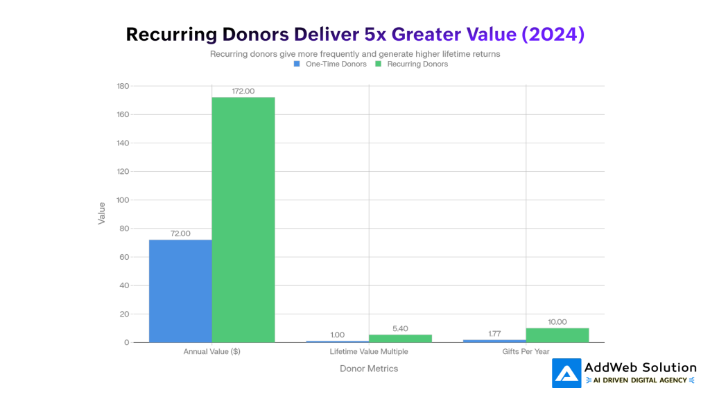
Recurring donors don’t just give more once – they give more over time. On average, they bring in over twice the yearly revenue of one-time donors and stick around far longer. In simple terms, they’re more loyal and far more valuable.
This isn’t a small lift – it’s a shift. Recurring giving has grown rapidly in recent years, and the nonprofits seeing the biggest gains aren’t guessing. They’ve intentionally designed their websites to make ongoing support feel easy, natural, and worth committing to.

Element 1: Trust Badges & Security Signals (42% Conversion Uplift)
The second someone lands on your donation page, they’re asking one thing: Is this safe? If the answer isn’t clear, they leave.
Small details – security icons, SSL locks, and familiar payment logos – do a lot of heavy lifting. When used well, trust badges can lift conversions by up to 42%. When they’re missing, many donors drop off simply because they don’t feel confident sharing their details.
Why it works is simple: visible security reduces anxiety. A padlock near the form, a “your info is secure” message, or logos like Visa, PayPal, or Apple Pay reassure donors at the exact moment they’re about to commit.
Place trust signals where it matters most: near the payment fields, close to the donate button, and again at the bottom of the page. Keep them clean and mobile-friendly – enough to build confidence, not so many that they create clutter.
Element 2: Simplified Form Fields (39.4% Conversion Uplift)
There’s a simple rule: every extra form field loses donors. Even removing one field can significantly lift conversions. Each box adds friction, each scroll gives people a reason to leave.
Why It Matters
Donors don’t want to “fill a form” – they want to help. Ask for too much (phone number, full address, employer details) and giving starts to feel like work. Nonprofits that only ask for essentials – name, email, amount, and payment – see up to 39% higher conversions.
Keep It Essential
If the information isn’t critical to process the donation or send a receipt, skip it. Overcomplicated forms can cost you more than half of potential gifts.
Make It Feel Effortless
Pre-fill details when possible and use smart defaults. Small conveniences add up and keep donors moving forward.
One Step vs. Multiple Steps
On mobile especially, a clean multi-step flow (amount → info → payment) often performs better than a crowded single page. Less overwhelm means more completed donations.


Element 3: Mobile-First Optimization (34% Conversion Uplift)
More than half of nonprofit website traffic comes from mobile, yet most donation revenue still happens on desktop. That gap isn’t about donor intent – it’s about poor mobile experiences.
The Missed Opportunity
When donation pages are truly mobile-friendly, results change fast. Nonprofits that optimize for mobile see more than double the donations from phones. Simple design fixes alone can unlock major gains.
What Works on Mobile
High-converting mobile pages keep things easy:
- Big, thumb-friendly donate buttons
- Fast load times
- Clean, vertical forms
- Large, readable text
- One-tap payments like Apple Pay and Google Pay
Why Speed Matters
Mobile donors are impatient – for good reason. If a page takes too long to load, they leave. Every extra second costs donations.
Mobile giving may start smaller than desktop, but when the experience feels effortless, that gap closes quickly.
Element 4: Prominently Featured Recurring Donation Options
People don’t choose monthly giving by chance. They choose it when it’s easy, visible, and clearly the smart option.
Make It the Default
Pre-select “Give Monthly” and explain the impact in plain language. Most donors won’t change it – especially when they understand how monthly gifts help you plan and deliver consistent support.
Show It Everywhere
High-performing nonprofits reinforce recurring giving throughout the journey:
- Homepage: “Join 1,500+ monthly supporters”
- Donation page: “Sustain impact with a monthly gift”
- After checkout: a simple “Make it monthly?” prompt
Use the Post-Donation Upsell
After a one-time gift, ask donors to convert it to monthly. Even a small lift matters – just a few conversions per 100 donors can dramatically increase long-term revenue.
Lean on Social Proof
Remind donors they’re not alone. Messages like “Most of our supporters give monthly” make recurring giving feel normal, trusted, and worth committing to.
Element 5: Social Proof & Real-Time Impact Updates (20% Conversion Boost)
People give once because they care. They give again when they see proof it’s working.
Why Social Proof Works
Showing real activity – recent donations, donor names, or live progress – makes giving feel normal and trusted. Messages like “23 people donated today” or “Sarah just gave $50” quietly say: others believe in this too. When done right, social proof can lift conversions by around 20%.
Show Impact, Not Vague Promises
Generic lines like “Every dollar helps” don’t stick. Clear outcomes do:
- “$50 feeds a family of four this week”
- “$10/month supports a student all year”
Pair impact with real stories. A face, a name, and a result create emotional connection – and that’s what drives repeat giving.
How to Use It
Add a simple, clean feed showing recent donations or impact updates. Keep it fresh and human. Momentum is contagious, and donors want to be part of something that’s clearly moving forward.
Element 6: Strategic CTA Button Design & Visual Hierarchy
The donate button isn’t decoration – it’s where the decision happens.
Color: Contrast First, Psychology Second
What matters most is contrast. If the button blends in, it won’t get clicked. That said, colors do carry meaning:
- Red / Orange: urgency and action (great for campaigns)
- Blue: trust and security (safe for most causes)
- Green: growth and positivity (ideal for environment or health)
No contrast = no clicks. In fact, removing distractions and forcing focus on the main donate button has nearly doubled donations for some nonprofits.
Copy & Size Matter
Use clear, action-driven text. “Donate Now” works better than vague labels. Make the button big, bold, and easy to tap – especially on mobile – and place it right where donors are ready to commit.
Element 7: Multiple Payment Methods & Digital Wallets (4.6% Conversion Boost + Speed)
People want to give in the way that feels easiest to them. Fewer options means more drop-offs.
The Power of Digital Wallets
Adding Apple Pay or Google Pay can noticeably boost conversions. Why? Speed. Donors can give in seconds – no card details, no forms, no friction. This is especially powerful on mobile, where most wallet-based donations happen.
Why It Works
When giving is fast, impulse turns into action. Digital wallets remove almost every barrier between wanting to help and actually donating.
Offer Multiple Payment Options
High-performing donation pages include:
- Credit & debit cards
- PayPal
- Apple Pay & Google Pay
- Bank transfers (ACH)
- Flexible recurring options
Each option meets a different donor preference. The easier you make it to give, the more people will.
Key Statistics at a Glance

Real-World Impact: Organizations Getting This Right
Case Study: Scope’s 40% Lift
Scope, a UK disability charity, increased donation conversions by 40% by doing two simple things: simplifying their form and adding digital wallets. No full redesign – just removing friction where it mattered most.
Mobile vs. Desktop Gap
Over half of nonprofit traffic is mobile, yet most donation revenue still comes from desktop. That gap is a missed opportunity. Nonprofits with mobile-optimized donation pages see more than double the mobile donations compared to non-responsive sites.
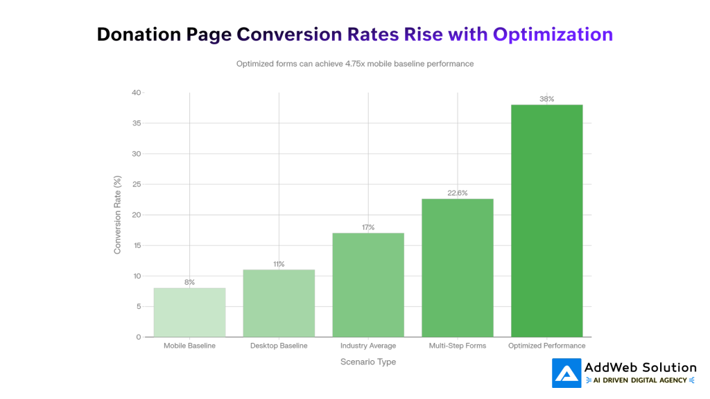
Why Form Structure Matters
Well-designed multi-step donation forms outperform cluttered single pages. Many nonprofits see conversion rates above 22%, with top performers reaching close to 40%. Small UX choices here can be the difference between steady growth and constant fundraising stress.
Building Your High-Converting Donation Experience: A Phased Approach
You don’t need perfection on day one. The goal is steady improvement, starting with what moves the needle fastest.
Phase 1: The Basics (Weeks 1–4)
Fix the obvious friction first:
- Add security and trust badges
- Remove unnecessary form fields
- Make your donate button clear and hard to miss
Impact: ~15–20% lift in conversions
Phase 2: Mobile & Speed (Weeks 5–8)
Meet donors where they are:
- Test on real mobile devices
- Optimize for responsive design and fast load times
- Add Apple Pay and Google Pay
Impact: another 20–25% boost
Phase 3: Psychology & Commitment (Weeks 9–12)
Encourage confidence and long-term giving:
- Show social proof and real impact
- Offer a “make it monthly” upsell
- Tie donation amounts to outcomes
Impact: another 15–20% gain
Phase 4: Measure & Improve (Ongoing)
Watch what works and keep refining:
- Track drop-offs and conversions
- Test messages, layouts, and payment options
- Learn from donor feedback
The Big Picture
Taken together, these steps can double your conversion rate over time. Small, focused changes add up to massive fundraising impact.
Conclusion
Recurring donations don’t grow because donors care more – they grow because giving is easier, clearer, and more reassuring. As this guide shows, small, intentional improvements to your donation experience can unlock outsized results. Trust signals reduce hesitation. Simplified forms remove friction. Mobile-first design meets donors where they already are. Clear impact messaging, social proof, and visible monthly giving options turn one-time generosity into long-term commitment.
The organizations seeing 30–40% lifts in conversions aren’t doing anything magical. They’re respecting donor behavior and designing around it. And the best part? You don’t need to fix everything at once. Start with the basics, improve in phases, measure what works, and keep refining.
In a landscape where predictable revenue is critical to mission sustainability, your website isn’t just a communication tool – it’s your most important fundraising asset. When you remove barriers between intent and action, recurring giving becomes the natural outcome, not the exception.
Source URLs
- https://givingusa.org/building-a-resilient-nonprofit-the-impact-of-recurring-donors-explained/
- https://doublethedonation.com/nonprofit-fundraising-statistics/
- https://rallyup.com/blog/online-fundraising-statistics/
- https://blog.charityengine.net/recurring-giving-statistics
- https://ecnl.org/sites/default/files/2021-05/ECNL%20Comparative%20research%20on%20digital%20fundraising%202021%20FINAL.pdf
- https://proinfo.gofundme.com/rs/673-DCU-558/images/the-ultimate-guide-to-recurring-giving_V8.pdf
- https://virtuous.org/blog/recurring-giving/