


For most ecommerce teams, user experience is seen as an extra to design once you have space on your roadmap for it. The numbers say otherwise.
Incremental interface tweaks that are well-tuned can result in some of the biggest gains possible for a young company, beating out entire redesigns for a much lower cost and risk..
Why UX Is a Revenue Lever, Not Just a Design Concern
Each extra field on the checkout page, each ambiguous price point, and each additional half-second of loading time is a minuscule tax levied upon conversion rates.
Each in isolation is easily dismissed. When collected for thousands of interactions, however, they become one of the biggest sources of lost money in ecommerce.
On average, the rate of shopping carts being abandoned in ecommerce is 70.22%, according to Baymard Institute’s meta-analysis of more than 50 studies encompassing more than 4,000 checkouts.
Of all those abandoned carts, Baymard Institute estimates that about 35% can be recovered solely through improvements in the checkout process, which amounts to around $260 billion worth of business that is just waiting to be recovered in the US and EU.
This has nothing to do with acquisition, advertising, and market fit; this is merely interface friction.
Thus, user experience moves away from being a cosmetic measure and becomes a financial one – every store that manages to reduce interface friction even by a few percentage points is recovering lost revenue.
Why Small Changes Outperform Big Redesigns
Large-scale redesigns inherently have risks associated with them. They involve changing multiple factors at once, take months to deliver, and make it impossible to link the outcome to a specific decision.
This is why small-scale changes have an advantage – they deliver quickly, link cause and effect, and, most importantly, multiply.
The Compounding Mechanism
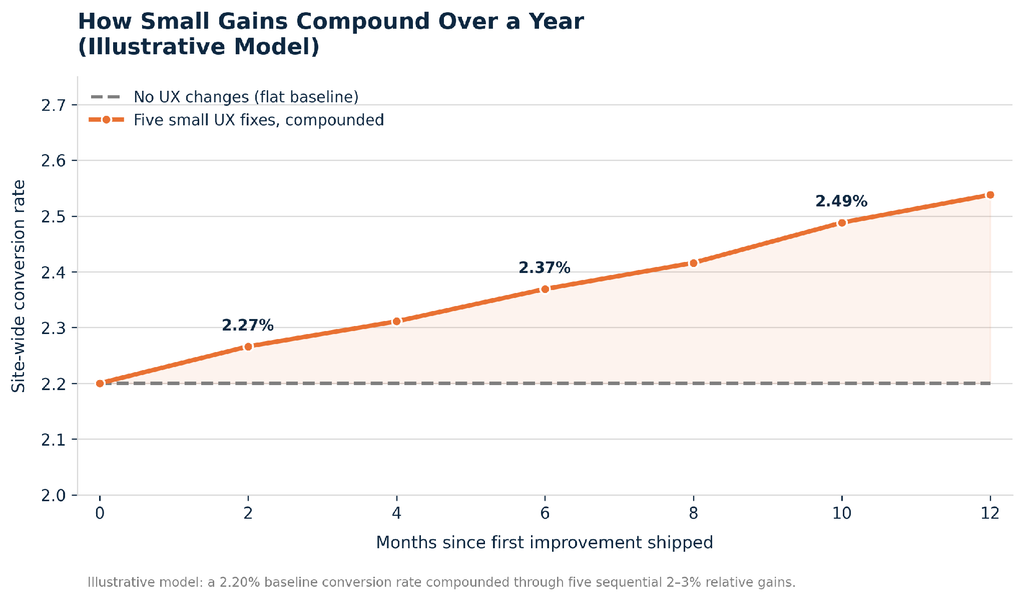
An individual increase of 2-3% in conversion rate seems insignificant taken alone.
But when done incrementally, as part of a series of independent changes, the impact becomes multiplicative, not additive.
The graph below shows this, in terms of an illustrative series of five small changes made over one year.
This is the mechanical argument behind the need to favor many smaller deployments over fewer bigger deployments:
A team releasing one fix per quarter is not in the same league as a team releasing one fix every two weeks, regardless of how much engineering work is required in both cases.
Where Small UX Improvements Pay Off Most
Not all friction is created equal. Four areas consistently produce disproportionate returns relative to the effort required to fix them.
Checkout and Forms
The checkout process is the most impactful user interface surface for ecommerce since it’s the closest thing to the actual transaction.
The research conducted by Baymard on the checkout usability has revealed that the average number of default form fields in an American checkout process totals 23.48 whereas only 12-14 are enough for a good design.

Page Speed and Performance
The checkout page is one of the most influential surfaces in ecommerce in terms of the user interface because it is the point closest to the transaction itself.
According to the results of Baymard’s research on checkout usability, there are 23.48 default form fields in the checkout process in the United States, but only 12-14 are needed.
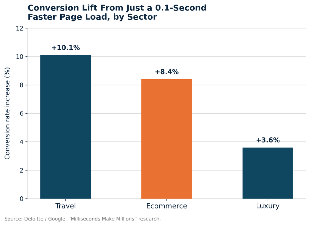
Separately, Portent’s analysis of over 100 million pageviews found ecommerce sites loading in one second convert at 3.05%, compared with 1.08% for sites taking five seconds, nearly a threefold difference driven entirely by load time.
Navigation and Search
Site search and category navigation are silently responsible for gating off a great deal of money since they are responsible for deciding whether an intention-to-buy customer actually gets to see that product page. Solutions to this problem are:
- Search resilience: Autocomplete and typo tolerance in the search bar, since a failed search often ends the session entirely.
- Live filtering: Filters that update result counts live, reducing the number of dead-end searches.
- Breadcrumb trails: Persistent breadcrumbs so users can move backward without losing their place.
- Filter visibility: Clear indication of applied filters and an easy way to clear them.
Mobile-Specific Friction
The majority of ecommerce sessions currently happen via mobile.
However, the conversion rate via mobile is structurally lower compared to desktop; for example, due to small tap areas, greater number of form fields relative to the screen, and higher use of mobile payment confirmation.
The rate of abandonment via mobile exceeds that of desktop in almost all benchmarking tests. Furthermore, mobile abandonment is up to 20% higher than desktop abandonment for each additional second of loading time.
Minor improvements such as native autofill, bigger tap areas, and biometric checkout will help fix that.
Trust and Credibility Signals
Security badge visibility, return policy transparency, and delivery time estimates can be made at a low cost and will tackle some of the leading reasons for abandonment presented in Figure 2, such as payment information distrust and uncertainties regarding delivery times.


The Data: Micro-Changes and Their Typical Impact
The table below summarizes commonly documented, low-effort UX changes alongside the revenue or conversion impact reported in independent research.
| UX Change | Typical Impact | Why It Works |
|---|---|---|
| Remove forced account creation | Addresses a cause cited by 25% of abandoners | Removes a mandatory step with no transactional value to the user |
| Show total cost before final step | Addresses the #1 abandonment driver (48%) | Eliminates the “surprise cost” moment that breaks trust |
| Cut checkout to 12–14 form elements | Closes the gap from a 23.48-element average | Shorter forms lower perceived effort and completion time |
| 100ms faster page load | ~1% conversion gain per 100ms, per aggregated A/B data | Reduces friction at the exact point of decision |
| 1-second faster mobile load | Up to 27% increase in mobile conversion in case studies | Mobile users show the lowest tolerance for delay |
| Add live delivery estimates | Addresses a cause cited by 18% of abandoners | Removes uncertainty around fulfillment timing |
A Framework for Prioritizing UX Investments
Not every proposed fix deserves a place in the current sprint. Plotting changes against expected impact and required effort keeps a UX backlog honest and prevents low-value work from crowding out high-leverage fixes.
Impact vs. Effort Matrix
| Quadrant | What Belongs Here | Typical Action |
|---|---|---|
| High impact / Low effort | Cost transparency, guest checkout, form-field reduction, autofill | Ship immediately, these are the default backlog priority |
| High impact / High effort | Full checkout rebuild, payment method expansion, mobile redesign | Sequence deliberately; break into smaller shippable pieces |
| Low impact / Low effort | Micro-copy edits, icon refreshes, minor spacing adjustments | Batch into existing sprints; never block on these |
| Low impact / High effort | Full visual rebrand for marginal functional gain | Deprioritize unless there is a non-UX business driver |
Where the Backlog Typically Concentrates
Applying this framework to a typical mid-market Shopify store, the quick-win backlog tends to cluster around four to five categories, with checkout and page speed consistently claiming the largest share of high-impact, low-effort work.

Common Pitfalls When Chasing Big UX Overhauls
- Impact confusion: Redesigns pack in hundreds of changes at once, meaning there is no way to know which change really made the difference.
- Outdated feedback cycles: Months-long redesign cycles mean validation will always be out of date by the time that market conditions or the catalog itself have changed.
- Risk of rollback: The full rebuild inherently represents more engineering and testing risk than does making iterative improvements.
- Cost of missed opportunity: Teams focused on achieving an impressive redesign may neglect necessary but less exciting changes that yield higher ROI.
Building a Culture of Continuous UX Refinement
Instrumentation Before Intuition
Each suggested modification should have its roots in some particular problem of analytics, recording sessions, or usability testing, not in a stakeholder’s sense of aesthetics. This will help maintain the backlog based on facts, not opinions.
Ship Small, Measure Fast
Changes scoped to a single variable and shipped within one to two weeks produce cleaner data and faster course correction than quarterly release cycles.
Document What Worked
A running log of shipped changes and their measured impact turns a store’s UX history into a reusable playbook, reducing the need to re-litigate decisions with each new team member.
Key Takeaways
- Preventable loss is measurable: Roughly 35% of cart abandonment is preventable through checkout UX alone, per Baymard Institute, a direct, quantifiable revenue opportunity.
- Small gains compound: A 2–3% improvement, repeated across several independent fixes, produces a meaningfully larger annual lift than a single large redesign.
- Checkout is the highest-leverage surface: Cost transparency and checkout length are the two highest-leverage, lowest-effort fixes available to most stores.
- Speed is a conversion input, not a technical metric: A 0.1-second improvement in load time produced measurable conversion gains across every sector studied by Google and Deloitte.
- Prioritization prevents wasted effort: An impact-vs-effort framework keeps a UX backlog focused on the changes that actually move revenue.
Identify the small user experience issues costing your store conversions and prioritize the fixes that can deliver the biggest impact.

Pooja Upadhyay
Director Of People Operations & Client Relations
https://baymard.com/lists/cart-abandonment-rate
