


An action plan, backed by benchmarks, to understand and change the interface and interactions that make your Shopify stores convert.
When most Shopify store owners see a stagnant conversion rate, they increase traffic spending.
This is only going to make things worse, because it simply funnels more users through checkout flows, navigation menus, or product pages that were causing them to abandon their purchase paths.
User experience-based conversion optimization will cost you less than advertising and will have compounding effects – every time you change something to make UX better, you’ll improve conversions for everyone who ever uses the site again.
In this post, you will learn about twelve specific and testable user experience changes for your Shopify store, sorted by their placement in the customer journey and the benchmarks you should track.
Why UX Is the Highest-Leverage CRO Lever
Conversion rate optimization is too frequently seen as a copywriting task or a matter of offering discounts.
The reality is that the biggest and most lasting impact can be made by reducing friction in the customer’s journey from discovery to purchasing the product, which is a process-based activity and one which continues paying dividends well after the marketing campaign is over.
Three shifts have made this the higher-leverage lever over the last few buying cycles:
- Customers go through touchpoints on mobile devices, computers, and apps all in the same purchasing decision, meaning that a UX weakness at one point lets the entire sales funnel drain away.
- The cost of paid acquisition has been rising, which makes it far more economical to extract more income from current visitors than it is to acquire new ones.
- The standards established by major retailers, instant search results, instant payments, and shipping transparency are what customers use to judge each Shopify website.

Combined, checkout friction and page loading time make up almost half of lost conversions in the graph above.
Both are UX-related issues that can be fixed and not traffic-related problems – hence the focus on the following dozen tips starting right here.
The 12 UX Improvements, Organized by Where They Work
Each improvement is sorted according to which area of the customer’s journey it impacts. This will help you sort according to which areas of your own marketing funnel need work.
Navigation & Product Discovery
1. Simplify the Main Navigation and Mega-Menu
The navigation should only be pared down to the categories that consumers actually use, based on usage analysis from the click map or search term analysis, and not the internal preference for the products being merchandised.
Any mega menu that goes deeper than two levels adds time to first click.
2. Add Faceted Search and Smart Filters
Allow users to filter products based on price, size, color, material, and availability without reloading the entire page.
Faceted filters can be one of the quickest user experience upgrades to implement for Shopify since almost all themes and apps have built-in support for them.
3. Build Predictive, Typo-Tolerant Search
Onsite search is much more successful than browsing due to the fact that on-site search targets those customers who already know what they are looking for.
Predictive search, synonym match, and typo tolerance reduce the difference between customer queries and your catalog vocabulary.
Product Page & Trust Signals
4. Use High-Quality, Zoomable Imagery and Video
Product pages with zoom, multiple views, and short videos have higher conversions than static pages with a single image, especially when products like clothing, furniture, and those where texture or fit influences sales decisions.
The quality of images is an UX choice that can be traced back to revenue.
5. Surface Reviews and User-Generated Content Near the Buy Box
The star ratings and a few recent reviews posted closer to the add-to-cart button have a greater impact on conversions than the same information posted under a tab. Nearness is more important than the amount of information.
6. Clarify Shipping, Returns, and Fit Information On-Page
Customers who need to leave the page where the product is being sold in order to see the shipping price and the return option will probably not return.
If these items are placed at the product page, then one of the biggest reasons for abandonment is eliminated.
Checkout & Payment UX
7. Enable Guest Checkout
The need to create an account before making a purchase is arguably one of the easiest ways to abandon the checkout process.
With guest checkout and account creation at a later stage, the transaction is completed before the relationship begins.
8. Offer Accelerated Payment Options
One-click wallets such as Shop Pay, Apple Pay, and Google Pay take out the most error-prone part of checkouts – manually typing in a card number on your mobile device.
Retailers that feature such options on their cart page above the fold experience significantly more checkout beginnings.
9. Show a Persistent Progress Indicator and Upfront Costs
Steps indicator (cart, information, shipping, and payment) visible and taxes or shipping costs displayed before the last step will eliminate two main reasons for shopping cart abandonment in the last second – lack of certainty how much is remaining and fear of the final cost total.
Mobile & Site Performance
10. Optimize Core Web Vitals and Page Speed
LCP, ITNP, and CLS metrics are no longer an SEO problem; rather, they relate directly to bounce rate and conversions on Shopify websites, particularly mobile sites.
In most cases, image compression, app/script audit, and theme cleanup are always the quickest fixes.
11. Design Thumb-Friendly Tap Targets and a Sticky Add-to-Cart
The traffic to over two-thirds of Shopify stores is mobile traffic in most cases.
The use of buttons designed for the thumb and an add-to-cart bar that does not hide as you scroll through the long product page removes this friction.
12. Add Cart-Recovery Micro-Interactions
The gentle and timely prompts, the saved-cart message, the low-stock warning, the one-click return to your cart via an email/SMS – all these allow you to make money without the hassle of aggressive exit-intent pop-ups, which often cause more harm than good.


The 12 Improvements at a Glance
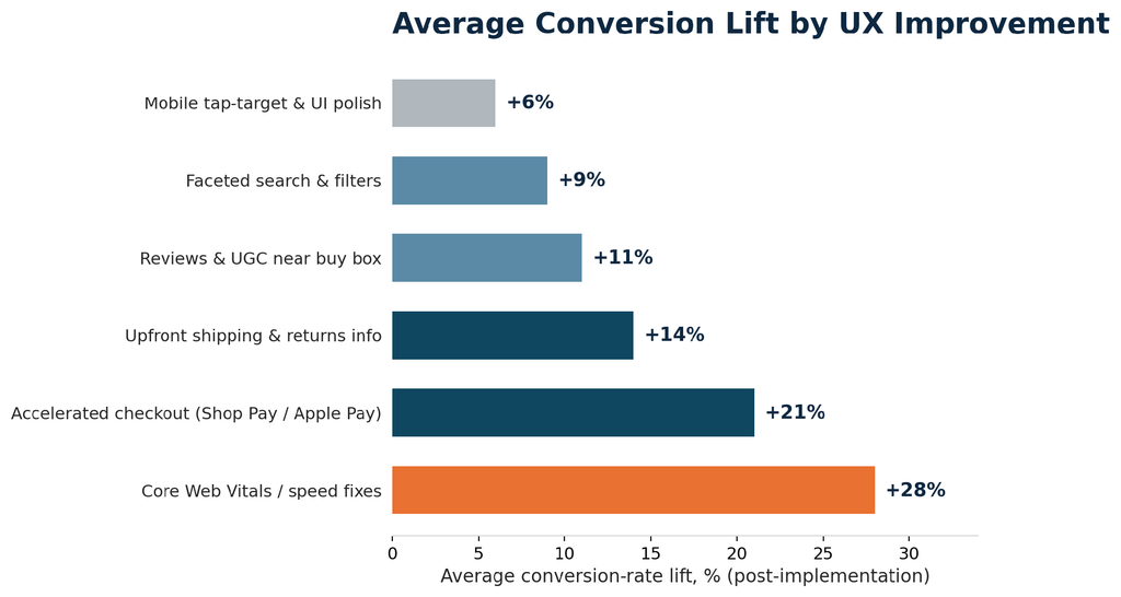
Use this table to prioritize: effort reflects typical implementation complexity on a standard Shopify theme, and lift reflects the average conversion-rate impact reported across the improvements shown in Figure 2.
| UX Improvement | Category | Effort | Avg. Lift |
|---|---|---|---|
| Simplify navigation & mega-menu | Discovery | Low | +4-6% |
| Faceted search & smart filters | Discovery | Medium | +9% |
| Predictive, typo-tolerant search | Discovery | Medium | +7-10% |
| High-quality zoomable imagery/video | Product page | Medium | +8-12% |
| Reviews & UGC near the buy box | Product page | Low | +11% |
| Upfront shipping & returns info | Product page | Low | +14% |
| Guest checkout | Checkout | Low | +10-15% |
| Accelerated payment options | Checkout | Medium | +21% |
| Progress indicator & upfront costs | Checkout | Low | +8% |
| Core Web Vitals / speed fixes | Performance | High | +28% |
| Thumb-friendly mobile UI | Performance | Medium | +6% |
| Cart-recovery micro-interactions | Performance | Medium | +5-9% |
Benchmarks: What Good Shopify UX Looks Like
“Better UX” is only useful as a goal if it’s tied to numbers your team can measure before and after a change ships. The table below anchors the improvements above to concrete baseline and target figures.
| Metric | Typical Baseline | Optimized Target | Why It Matters |
|---|---|---|---|
| Overall conversion rate | 1.5-2.5% | 3.0-4.0% | Direct measure of funnel health |
| Mobile bounce rate | 55-65% | Under 40% | Mobile is most stores’ largest segment |
| Checkout completion rate | 55-65% | 80%+ | Isolates payment-step friction |
| Cart abandonment rate | 70-75% | Under 60% | Flags late-stage cost or trust issues |
| Largest Contentful Paint | 3.5-5s | Under 2.5s | Strongly correlated with bounce |
| Average time to first product click | 20-30s | Under 10s | Reflects navigation & search quality |
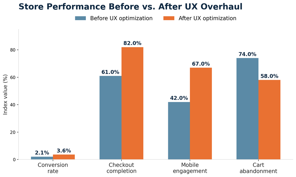
The checkout-completion and mobile-engagement gains are usually the first ones a merchant notices operationally; the conversion-rate gain is the one that shows up in revenue reporting a few weeks later.
Implementation Checklist
For teams scoping this as a project, the sequence below reduces rework and keeps the highest-impact fixes first.
- Extract funnel analytics by device and page type before making any changes and prioritize based on which has the biggest drop off.
- Do a Core Web Vitals check and optimize speed; everything else will perform better on a fast site.
- Streamline navigation and incorporate faceted search with existing functionality before developing something custom.
- Check the product page template for lack of trust indicators, reviews, shipping information, returns information, and add them above the fold.
- Implement guest checkout and quick payment options, and make sure they show up correctly in the mobile checkout process.
- Test one change at a time where possible, to be able to attribute a lift to a specific improvement.
- Benchmark table from above re-measured 30 and 90 days post-launch to ensure that the improvements are sustained after novelty wears off.
Common Mistakes and How to Avoid Them
Redesigning Without Funnel Data
Redesigns based on aesthetics instead of using drop-off data can end up refining those aspects of the funnel that have already been successful without fixing the actual problem. Get your pull analytics before you touch the template.
Treating Mobile as an Afterthought
Scaling down from the design of a desktop environment to create a design goes against the grain of the usual method used on most Shopify websites where the mobile visits outnumber the desktop visits.
The designer must begin with designing mobile touch targets, stickies, and checkout forms and then validate them on mobile devices.
Chasing Trends Instead of Friction
Parallax Scrolling, autoplaying video backgrounds, and large hero animations look great in a portfolio, but all too often create a load and mental overhead that does not solve any actual problem. Each element must relate back to a certain pain point.
Measuring Success
Once changes are live, track these on an ongoing basis rather than treating the redesign as a one-time event:
- Conversion rate per device, both mobile and desktop, separately.
- Conversion drop-off per step in the checkout funnel process, not just conversion rate.
- Scores from Core Web Vitals for the templates which have the highest traffic – home page, collections, and products pages.
- Abandonment rate of cart and checkout process, month-by-month compared to the baseline in the table above.
Closing Thought
All these 12 changes do not involve the complete reconstruction of the store. They mostly deal with template, app, or configuration fixes that can be introduced gradually by a Shopify team.
Those stores that consider UX as an ongoing process and not a one-time redesign carried out every couple of years are those that continue converting better amid ever-rising acquisition costs.
Turn Better UX Into More Ecommerce Sales

Pooja Upadhyay
Director Of People Operations & Client Relations
Source URLs:
https://baymard.com/lists/cart-abandonment-rate
https://baymard.com/research/cart-abandonment-rate
https://web.dev/case-studies/milliseconds-make-millions
