

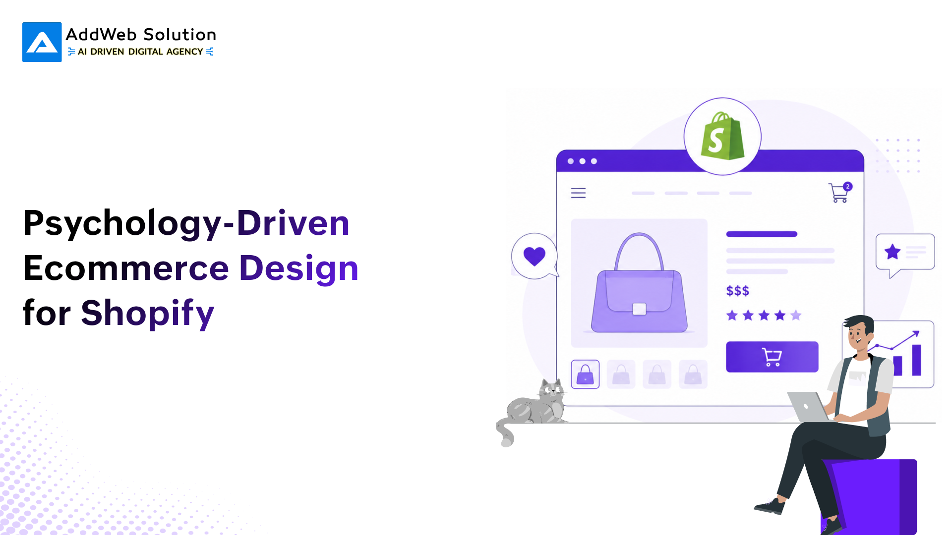
Why Psychology Belongs in Your Design Stack
The average Shopify store owner spends on ads, SEO, and photography. But in their store, the store owner is leaving money on the table. The decision to buy isn’t a purely rational process, it’s a chain of micro-decisions driven by visual hierarchy, cognitive load, social proof, and trust. Studies on the human mind in behavioral economics and consumer psychology have been conducted for many decades. The issue for the e-store owner is “Is your store design working with these mechanisms, or against them?”
This is not a article on dark patterns or manipulation, rather a design for how the human brain perceives decisions, lowering cognitive load, creating confident decision-making, and moving people from curious to committed.
The Core Psychological Principles at Play
Cognitive Load Theory
The working memory of human beings is very limited. When there is a page with overwhelming options, information-dense copy, or a non-clear visual hierarchy, people will respond with “no,” not because the product itself is incorrect, but because the decision feels too expensive. It’s your design task to decrease the cognitive burden at each step.
- Minimize the number of primary choices: According to Hick’s Law, decision time increases logarithmically with the number of choices. Product pages with 3-5 clearly different variants will outperform grids of 20+.
- Visual hierarchy is intentional: Size, contrast, and white space guide the eye. The number one action, Add to Cart, should win the visual competition on every page.
- Chunk information: Break long product descriptions, shipping policies, and checkout forms into clearly defined sections. Progressive disclosure-show less at first-will keep your pages from overwhelming the user without hiding essential details.
The Principle of Reciprocity & Loss Aversion
Prospect Theory(Kahneman & Tversky) showed that losses are about twice as powerful as gains. Framing is critical in e-commerce:
- Free shipping: “Don’t lose free shipping, just add $12 more to your cart” Vs. “You are $12 away from free shipping.” Framing 1 triggers loss aversion.
- Limited offers utilize potential loss, not potential gain: “I will miss out on this deal,” rather than, “I will make this deal.”
- Exit-intent popups showing abandoned products(“You are leaving these behind”) outperform simple discount popups in every A/B test.
Social Proof and the Wisdom of Crowds
Social proof was one of the six principles of persuasion, established by Robert Cialdini. In e-commerce, it is not a nice-to-have; it is the conversion minimum.
How does it work? When people don’t know how to feel about something, they go with the majority. Our job here is simply presenting social proof in the correct context, the correct format, and the correct level of detail.
")
Figure 1: Top reasons for cart abandonment (Source: Baymard Institute, 2024)
Authority and Trust
Uncertainty kills conversions. Shoppers assess trustworthiness in milliseconds, and design signals play a primary role. Authority is built through:
| Trust Signal | Where to Place It | Conversion Impact |
|---|---|---|
| SSL badge / Secure checkout icon | Near payment fields | High directly reduces security anxiety |
| Money-back guarantee | Product page & cart | Reduces perceived financial risk |
| Press/media logos | Homepage & product page | Borrowed authority from known brands |
| Real customer photos in reviews | Product page, below fold | Higher trust than text-only reviews |
| Live visitor/purchase count | Product page | Social proof + urgency (use honestly) |
| Expert certifications/awards | Homepage, footer | Category-relevant credibility |
Applying Psychology at Each Stage of the Shopify Funnel
Homepage: First Impressions & Value Anchoring
You’ve got 50ms, the amount of time a visitor takes to form their initial impression of your store. In that moment, your visual design, load speed, and above-the-fold messaging all converge. Psychological needs at this moment include:
- Value anchoring: Make outcome-not feature-your primary focus. “Sleep better in 7 days” versus “Memory foam mattress with cooling gel layer” as a headline in a hero section on cold traffic would be more effective.
- Identity signaling: We are tribal. If your product signals inclusion in a group that the customer identifies with, you have dramatically decreased their timeline for trusting you.
- Contrast pricing: Showing an original price next to a sale price; the ‘anchor’ of the higher price makes the sale price appear to be a bargain. This is anchoring bias in action.
Design checklist for the homepage:
- Hero loads within 2.5s (LCP 2.5s per Google Core Web Vitals)
- A single primary CTA above the fold.
- Social proof should be viewable without scrolling (star rating, number of reviews, press logo)
- Value prop should be readable in a single sentence
- Viewport is less than or equal to width, cannot scroll horizontally; tap targets are 44px.
Product Page: Decision Architecture
The product page is where the purchase decision is made, or abandoned. Every element either supports or undermines the mental process of evaluation and commitment. Here’s the breakdown:

Figure 2: The TRUST Framework – five pillars of psychology-driven product page design
Images and the Endowment Effect
This refers to an increase in perceived value when people feel ownership of an item. High-quality product imagery, which allows the user to visualize ownership, lifestyle imagery, 360s, zooms, and video footage, significantly impacts purchase intent. For Shopify – include at least one lifestyle shot per product, which clearly demonstrates the product being used. Minimize cognitive load and enable the user to relate to scale (e.g., product being held in a hand, worn by someone).
Scarcity and Urgency Signals
Real scarcity causes the Fear Of Missing Out, perhaps the most predictable buying trigger. Rules to follow:
- Show actual inventory levels (“Only 4 left in stock”) only if the stock really is low. Any fake urgency turns the shoppers off and ruins trust.
- Use timers for actual time-limited offers (sale ending soon, flash sales) to create a feeling of urgency in a truthful way.
- Show recently bought triggers (“Sarah from Manchester just bought this”) as real-time, or transparently attributed.
Cart & Checkout: Where Psychology Has the Highest ROI
Checkout abandonment is the most expensive leak in any Shopify store. The psychological challenges at this stage are specific: commitment and consistency, anxiety reduction, and minimizing effort.
")
Figure 3: Conversion lift from psychology-driven checkout tactics (compiled from Shopify, Stripe, and Baymard research)
Progress Indicators
Zeigarnik effect: How humans tend to remember and be attracted to tasks that they haven’t completed. A checkout progress bar (“Step 2 of 3”) leverages the Zeigarnik effect: a task that’s been initiated wants to be completed. With the Shopify 1-page checkout, it lessens even more friction: Shopify states an average of ~4 seconds faster completion time than on their multi-page checkout.
Form Design and Friction Elimination
According to Baymard Institute’s benchmarks, the average checkout flow has 23.48 form fields, almost two times more than the recommended 12-14 fields. Every non-essential field is a choice and a task that may result in abandonment.
| Friction Source | Psychological Effect | Design Fix |
|---|---|---|
| Forced account creation | Autonomy violation, shopper feels coerced | Make guest checkout the primary path; offer account creation post-purchase |
| Too many form fields | Cognitive overload, effort cost exceeds perceived reward | Auto-fill, address lookup APIs, and remove non-essential fields |
| Unclear error messages | Frustration and confusion loop | Inline validation with specific, friendly error text |
| No payment method I trust | 13% of shoppers abandon due to loss of confidence | Display the full suite of accepted methods early in checkout |
| Unexpected fees at the final step | Violation of trust, classic bait-and-switch perception | Show shipping estimate on product page and cart; no surprises |
| No security signals near the payment | Anxiety spikes at the highest-stakes moment | SSL badge, accepted cards logos, guarantee text near the pay button |
Payment Psychology – The Final Mile
Payment is the moment of maximum friction. The shopper has committed psychologically, but the mechanics of paying can still break the deal. Payment UX is therefore not just a technical decision – it is a psychological one.

Figure 4: Contribution of psychological factors to overall revenue impact
Payment Method Coverage
Here, the data speaks for itself. Through a large sample test conducted by Stripe, adding at least one alternative relevant payment option other than card drove, on average, +7.4% in conversion and +12% in revenue. Research from Baymard indicated that the rate of “shopper left because preferred payment option not offered” is at 13%.
Translating that for Shopify merchants, Shop Pay, Apple Pay, Google Pay, and BNPLs (Klarna, Afterpay) should not be hidden and placed on the product page, but not just the checkout payment screen.
Buy Now, Pay Later (BNPL) and Perceived Affordability
BNPL’s psychology is simple. It turns one large purchase into multiple small ones. For all products that are priced higher than ~50/ $50, adding a message to the product page saying “from $12.50/month” results in a higher AOV and a decreased price-based abandonment. Worldpay stated BNPL as one of the fastest-growing payment categories in e-commerce on a worldwide scale.
Critical distinction: While BNPL should appear as an option, it should not be the default. Defaulting to BNPL for all users can weaken the feeling of value proposition on your brand.
Personalization and the Mere Exposure Effect
The Mere Exposure Effect, Zajonc’s finding that familiarity breeds preference, is one of the most actionable insights in e-commerce personalization. The more relevant your store feels to a returning visitor, the more they trust it, and the lower the barrier to purchase.
Behavioral Personalization on Shopify
- Recently viewed products – the simple and most effective form of personalization. Reduces the cognitive load of searching and reinforces the initial commitment that the customer made when they viewed that product.
- Predictive recommendations – “People who bought X also bought Y”. Amazon can capture around 35% of sales using its recommendation engine. Even very basic cross-sell and up-sell implemented within Shopify brings a lift in sales.
- Geo-personalization – by showing local currency and local payment methods, as well as local shipping times, the cognitive distance is reduced, and trust is created in the mind of international shoppers.
- Display price in visitor currency without a manual selector – eliminates one friction point and creates an expectation of user-centricity.
Post-Purchase Psychology
The purchase confirmation page and email are psychologically valuable real estate that most Shopify stores underutilize. Post-purchase, the customer’s “buyer’s remorse” window is open. Closing it with the right signals, order confirmation, delivery timeline, social proof of the right decision, and a community invite, turns a transactional exchange into the beginning of a relationship.


Mobile-First Psychology – Where Most Shopify Revenue is Won or Lost
More than 72% of Shopify store visits now originate from mobile devices (Shopify, 2024). Mobile UX is not a scaled-down desktop experience; it is a psychologically distinct context: smaller attention windows, thumb-driven navigation, interrupted sessions, and higher sensitivity to friction and load speed.
Thumb Zone Design
The thumb zone framework (Steven Hoober’s mobile UX research) maps the comfortable reach zones for one-handed use. Critical interactive elements, Add to Cart, checkout CTA, navigation, should sit in the natural thumb zone (bottom-center of screen), not at the top, where single-handed use requires stretching.
Speed as a Psychological Variable
Speed is not purely a technical metric on mobile; it is a trust and commitment signal. Google’s research indicates conversions can fall by up to 20% for each additional second of load time in retail contexts. A separate Google/SOASTA study found that mobile pages loading 1 second faster can see up to 27% higher conversion.
| Metric | Target | Business Impact if Missed |
|---|---|---|
| Largest Contentful Paint (LCP) | ≤ 2.5 seconds | Each 100ms above 2.5s costs ~1.3% conversion (Farfetch/web.dev case study) |
| Interaction to Next Paint (INP) | < 200ms | Sluggish interactions signal low quality — erodes trust |
| First Input Delay (FID) | < 100ms | Tapping Add to Cart with lag creates doubt and abandonment |
| Cumulative Layout Shift (CLS) | < 0.1 | Unexpected layout jumps cause accidental taps and frustration |
| Checkout load speed | Shopify one-page: ~4s faster | Direct checkout completion time impact (Shopify data) |
A/B Testing Psychology-Driven Changes – What to Prioritize
Psychology-driven design hypotheses are some of the most reliable in conversion rate optimization precisely because they are anchored in documented cognitive science, not guesswork. But they still need to be tested in your specific store context, against your specific audience.
High-Confidence Test Candidates
| Test Area | Hypothesis | Expected Direction | Difficulty |
|---|---|---|---|
| CTA copy | “Add to Cart” vs. “Get Mine” vs. “Buy Now” | Ownership/identity-framed copy lifts clicks | Low |
| Social proof placement | Reviews above fold vs. below | Above fold increases product page conversion | Low |
| Urgency signal | Low stock indicator vs. none | Low stock increases the purchase rate when genuine | Low |
| Guest checkout default | Guest first vs. account first | Guest default reduces abandonment by 10–25% | Medium |
| Payment method display | Payment logos in cart vs. none | Displaying logos reduces security anxiety | Low |
| Progress bar in checkout | Visible steps vs. none | Progress bar increases checkout completion | Medium |
| BNPL messaging on PDP | “From £X/month” vs. no BNPL | BNPL message increases AOV for high-ticket items | Medium |
| Exit-intent popup framing | Loss-framing vs. discount offer | Loss framing can outperform in segments | Medium |
Ethics, Authenticity, and the Long Game
Every psychological principle in this blog can be applied honestly or manipulatively. The distinction matters for both ethical and commercial reasons.
Manufactured scarcity, fake reviews, artificially inflated “was” prices, and countdown timers counting down to nothing are short-term tactics that erode long-term brand trust. As consumers become more sophisticated and platform policies tighten (both Shopify and regulatory environments), these tactics carry increasing risk.
Psychology-driven design, done right, is about alignment: making the actual quality and value of your product legible to the brain as quickly and clearly as possible. That is not manipulation, it is effective communication.
Key Benchmarks at a Glance
The table below consolidates the most actionable data points cited throughout this blog. These are figures appropriate for use in business cases, design briefs, and executive discussions.
| Benchmark | Value | Source / Context |
|---|---|---|
| Average cart abandonment rate | 70.22% | Baymard Institute (meta-average across studies) |
| “Too long/complicated checkout” abandonment | 18% of US shoppers | Baymard Institute UX research |
| Forced account creation abandonment | 26% of US shoppers | Baymard Institute UX research |
| Missing preferred payment method abandonment | 13% of shoppers | Baymard-cited |
| Conversion uplift: adding relevant payment methods | +7.4% | Stripe large-sample testing |
| Revenue uplift: adding relevant payment methods | +12% | Stripe large-sample testing |
| Apple Pay offered earlier vs end-of-checkout | 2× conversion | Stripe Express Checkout research |
| Checkout UX upside (large sites, solvable issues) | Up to +35.26% | Baymard Institute |
| One-page checkout speed improvement | ~4 seconds faster | Shopify (observed across buyers) |
| Conversion sensitivity: 1s load delay in retail | Up to -20% conversions | Google Ads product guidance |
| Mobile: 1s faster load | Up to +27% conversion | Google/SOASTA case study |
| LCP sensitivity past 2.5s | -1.3% conversion per 100ms | Farfetch/web.dev A/B study |
| Revenue from returning vs new customers | Returning spend 67% more | Bain & Company |
Final Thoughts
The stores that win in 2025 and beyond are not necessarily the ones with the largest ad budgets or the best products. They are the ones that understand how their customers actually think and build their entire shopping experience around that understanding.
Psychology-driven ecommerce design is not a collection of tricks. It is a systematic approach to removing the gap between a shopper’s intent and their action. On Shopify, where the technical infrastructure is increasingly robust, the design layer is where the real competitive differentiation lives.
Start with the highest-impact, lowest-effort changes: simplify your checkout form, add social proof above the fold, surface payment options earlier, and make your primary CTA win every visual contest on the page. Then build from there, testing systematically, measuring honestly, and always asking: Does this make it easier for someone who genuinely wants this product to buy it?
Discover how our Shopify experts create conversion-focused stores built around customer behavior and proven UX principles.

Pooja Upadhyay
Director Of People Operations & Client Relations
References:
https://baymard.com/lists/cart-abandonment-rate
https://www.statista.com/statistics/1228452/reasons-for-abandonments-during-checkout-united-states
https://stripe.com/blog/testing-the-conversion-impact-of-50-plus-global-payment-methods
https://web.dev/articles/vitals
https://web.dev/case-studies/farfetch
https://www.jstor.org/stable/1914185
https://lawsofux.com/hicks-law
https://help.shopify.com/en/manual/online-store/web-performance

